Ace
Technical editorial precision: typography, interaction, responsive behavior, and public-source evidence for Ace.
Explore the story Five interactive chapters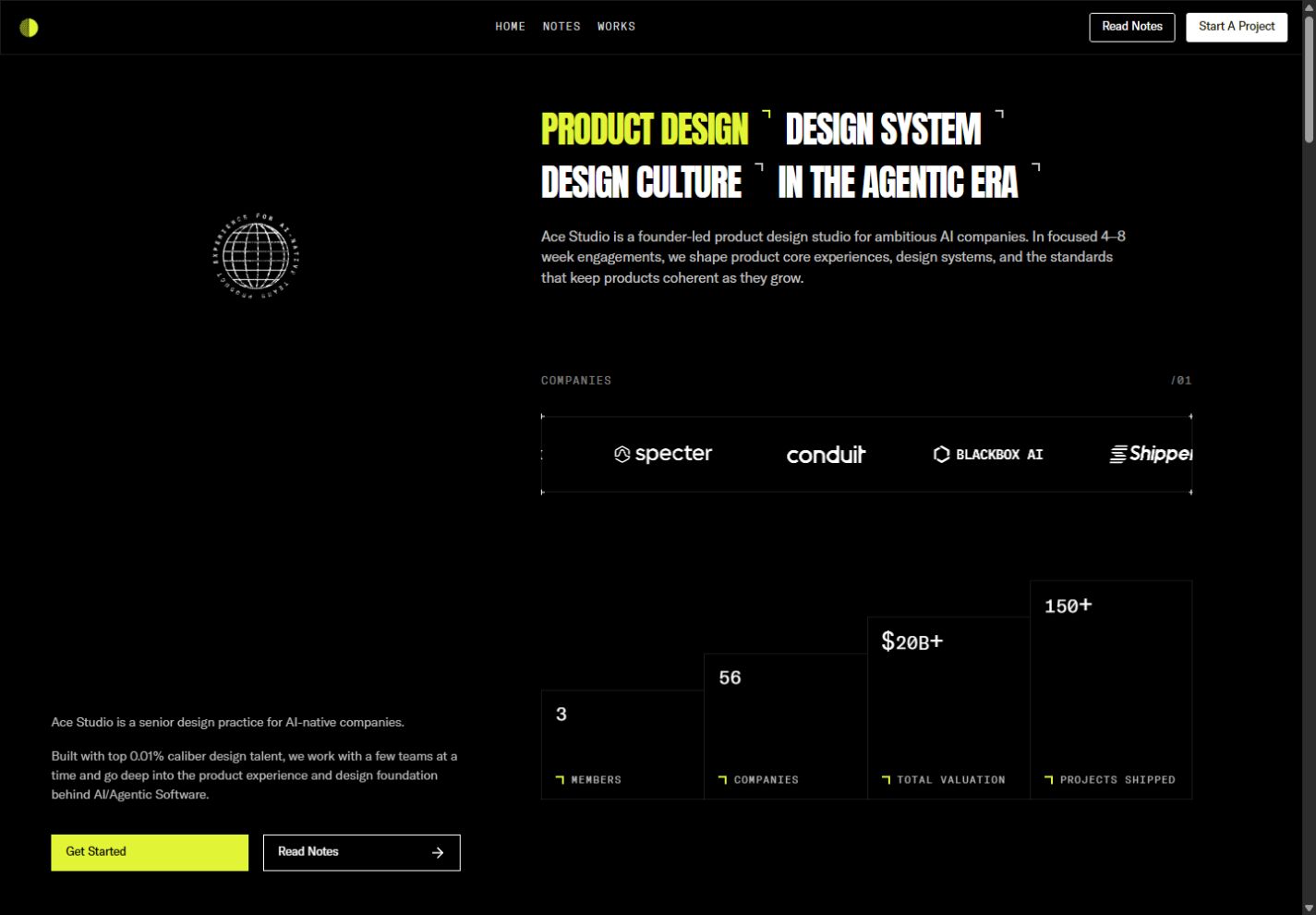
Ace desktop homepage with a fixed studio rail and scrolling project content.
Full size (new tab)Reviewed September 15–16, 2026 · Live website · Research findings
This page brings together the website review, typography follow-up, and public-source findings for Ace. Observed behavior, source-confirmed implementation, hook-only findings, and interpretation remain distinct. Viewports and shared coverage limits are recorded in Reading this research.
Website review
Creative assessment. Ace communicates a small, selective studio focused on AI product design. The dark ground, sparse lime signals, registration-like corner marks and technical lettering connect the idea of craft to systems thinking. Its strongest feature is the consistency of those small decisions. Its largest weakness is that mobile QA does not yet match the confidence of the visual direction. Live site
Typography, palette and layout
- Type: Anton supplies condensed uppercase service headlines. GT America Trial Light/Regular carries prose; GT America Mono supplies labels, names and testimonials. The custom ASCII image uses Chivo Mono; the orbiting seal uses Geist Mono. Those last two are component-specific, not general body fonts.
- Color: near-black surfaces including
#060606, subdued white/gray text and acidic lime#e1f435. Cyan and other colors appear in secondary content; project artwork supplies most of the richer color. - Shape: straight edges, fine borders, small corner ticks and rectangular controls. The effect is closer to a technical publication than a dashboard of rounded cards.
- Desktop composition: a fixed left area occupies roughly two-fifths of the screen, with a rotating seal/ASCII artwork, studio introduction and CTAs. The scrolling right area holds the narrative. The top navigation remains fixed.
- Rhythm: the right column alternates simple text with two-column project images and staggered outlined testimonial/service blocks. Deliberate empty cells make it feel composed rather than mechanically filled.
Ace desktop composition
Page sequence and secondary pages
The homepage moves from four service statements and an introduction to a moving company-logo strip, stepped numerical proof, six projects, testimonials, services, principles and a founder-led contact invitation. The counters settle at 3 members, 56 companies, $20B+ total valuation and 150+ projects shipped; these are site claims, not independently verified business figures.
The six work cards—Alpaca, Aster, Scout, Langdock, Twin and Marketer—use imagery to distinguish projects while their labels stay disciplined. Testimonials borrow a technical annotation style. This reinforces consistency but makes longer quotations feel small and low in the hierarchy. The service section repeats the outlined-grid language, with animated line symbols. Principle rows act as a concise manifesto and turn lime on pointer hover.
The Notes page is a long, narrow founder letter with large body text and cyan bracketed labels. It changes reading tempo appropriately; it is not a conventional article feed. The Alpaca case places metadata beside a large sequence of product screenshots. Public source confirms the other five cases share that general template, with mobile disclosure controls for metadata.
The published Works route is an empty black page, confirmed both visually and in its page component. The Laboratorium route instead shows a light personal-profile page, serif title, portrait, social circles and biography. That is a substantial identity change, with no clear experimental-lab framing in the opening view. Its intended relationship to the studio is unclear.
Interaction and motion inventory
| Trigger | Response | Evidence | Design assessment |
|---|---|---|---|
| Scroll into statistics | Numbers count upward, then stop | Observed + source | Makes proof noticeable; final values must stay readable |
| Pointer over a principle | Full row becomes lime with dark text | Observed | Strong, immediate state change |
| Pointer over globe seal | Globe accelerates; circular text rotates independently | Rotation observed; acceleration source-confirmed | Small optional delight that fits the identity |
| Pointer over ASCII artwork | Circular inversion/deformation follows the pointer | Configured source | A material treatment related to the technical theme |
| Pointer/touch over footer portrait | Pixelated canvas layer changes opacity | Source-confirmed | More distinctive than a generic image zoom |
| Open mobile menu | Partial-height drawer with navigation and contact actions | Observed | Leaves page context visible underneath |
| Case metadata disclosure | Name/overview/scope content expands | Source-confirmed | Appropriate compression of secondary content |
The ASCII instance uses contrast 5, Floyd dithering, @%#*+=-:., a smoothed circular inversion area and a 12px mono grid. The seal has counter-rotating text; configured hover boost doubles globe speed. Portrait pixelation is configured at 80px with spring stiffness 800, damping 60 and mass 1; touch clearing is delayed 500ms. These are implementation settings, not measured motion timings. Public Framer appearance code considers reduced motion for that subsystem; custom canvas/globe compliance was not established. Source details
Mobile changes and issues
At 390×844, the left sales/artwork rail disappears. The service headlines stack, the main flow becomes single-column, and stats/project cards become vertical. The top bar becomes a logo and hamburger; the desktop booking CTA is no longer persistently exposed there. The open drawer covers roughly the upper portion of the screen, with contact/booking below its links.
Confirmed defect: the introductory heading retains a 640px measured width starting at x=24 inside the 390px viewport. The surrounding layout clips the right side, cutting sentences mid-line. This is not just aggressive typography or an intentional oversized wordmark.
Confirmed navigation inconsistency: in the open mobile menu, Works led to /notes; Laboratorium's live link pointed to /404. The direct /works route is also empty. These need one consistent route/anchor model before further visual polish.
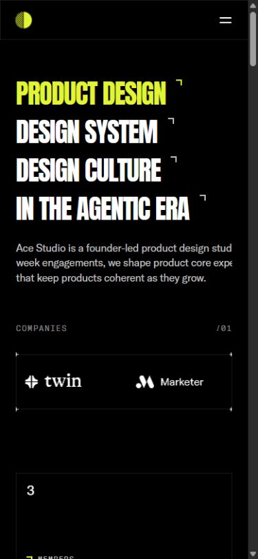 Ace at 390px: clipped introduction
What I would keep: the fixed desktop rail, restrained lime, technical texture and clear project imagery. What I would change first: responsive text constraints, mobile route targets, empty Works, and the unexplained Lab identity. Then improve long-quotation readability and ensure the mobile contact path remains easy to find.
Typography and pointer behavior
Type was sampled at 1440×1000 desktop and 390×844 mobile viewports. The table gives computed size / line height in CSS pixels. These are observed roles, not an exhaustive token specification or proof of a separate font file for each computed weight. Measurement method and limitations · Raw computed-style samples.
| Site and role | Typeface / weight | Desktop | Mobile | What the difference does |
|---|---|---|---|---|
| Ace service headlines | Anton 400 | 40 / 42 | 40 / 42 | Keeps the same emphatic type size; changes arrangement rather than scale |
| Ace explanatory heading | GT America Regular 400 | 16 / 22.4 | 16 / 22.4 | Reading size stays sensible, but the retained 640px box clips on mobile |
| Ace fixed-rail prose | GT America Light 300 | 14 / 21 | Rail removed | Quiet supporting context beside the dominant work stream |
| Ace chapter labels | GT America Mono Light 300 | 12 / 12 | 12 / 12 | +.1em spacing makes small labels feel like technical annotations |
Attention and reading order
The lime service phrase is the entry point, followed by the remaining condensed headlines, gray introduction and moving client strip. Project imagery then supplies proof. The persistent left rail forms a second reading lane: identity, a short explanation and booking/notes actions remain available while the portfolio scrolls.
This gives the desktop layout two functions at once: the right side demonstrates capability; the left side preserves context and conversion. The risk is divided attention. Both lanes explain who Ace is, while the projects require a separate downward journey. On mobile, removing the left lane reduces that duplication but also removes the ever-present invitation to act.
Type, spacing and grouping
Anton at 40px with −.03em tracking looks dense and decisive. It creates more perceived emphasis than its numerical size alone suggests. The 16px explanation is substantially calmer, while the mono chapter labels have wide +.1em tracking and reduced opacity. These are three clear voices: statement, explanation and annotation.
The desktop introduction is 640px wide. The rail prose is 448px wide, with 21px leading on 14px text. Those line lengths and generous leading make the supporting copy reasonably comfortable on desktop. The mobile introduction's unchanged width is the implementation failure: its type size is fine, its container is not.
Project name and product category are separate lines below the image. The image answers “what does the work feel like?”, the name identifies it, and the category explains relevance. This is effective information compression. Testimonials are more difficult: small uppercase mono treats substantial proof like metadata. I would give the quotation more reading priority while keeping attribution in mono.
Newly tested pointer details
- Hovering Read Notes changes its outlined dark treatment to lime with dark text. The alternate label/arrow treatment reinforces that the whole rectangle is interactive.
- Hovering the Scout project image produced a settled inner transform of 1.05 scale. Moving away released the hovered state. The outer card retained its place in the grid, so the image zoom adds response without rearranging the reading order.
- Moving over the headline did not reveal additional explanatory content in this pass. It should be understood as a statement, not an undiscovered accordion.
- The ASCII/globe/portrait code still supports the behaviors documented in the first review. This pass did not produce reliable visual confirmation of the ASCII inversion or portrait pixelation, so those remain source-confirmed rather than upgraded to fully observed.
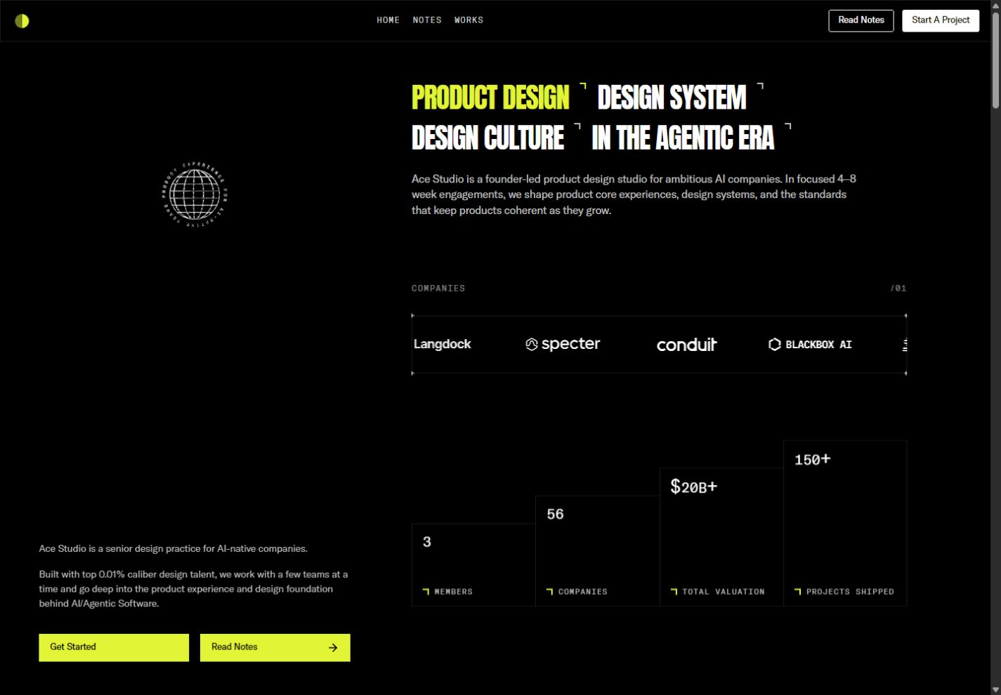 Ace: Read Notes changes from outline to lime on hover
Direction I would give the team: retain the technical voice, but make meaningful proof easier to read. Fix the mobile text box and navigation first. Then distinguish the testimonial statement from its attribution, and keep a clear mobile contact action close to the work.
Public-source audit
These findings come from public HTML, CSS, JavaScript, and sitemaps. A shipped definition does not prove an active feature: configured means an invocation or page markup is present; implemented means its handler was inspected; hook only means the custom handler was unavailable. Source scope and limitations.
- Ace HTML: https://acedesign.io/; page bundle https://framerusercontent.com/sites/3ZCVgDgJmNFmhxsu3U6NDN/ZtjpnfryboeNkIbiqgmIC58OsEq7Uq5TjX8rLjG-wag.BV0EGYq6.mjs.
Typography and visual tokens
The homepage's rendered text styles explicitly use GT America Trial Lt, GT America Trial Rg, GT America Mono Trial Lt/Rg/Md, Anton, and Spline Sans Mono. Font-face definitions confirm light 300, regular 400 and mono medium 500. The HTML also declares GT America Trial Cm Bd 700, TASA Orbiter, Jomolhari, Geist, Chivo Mono, Geist Mono and Inter; declaration does not establish that every font is visible on this page. In particular, some may serve embedded components or other shared Framer elements. The actual ASCII component invocation uses Chivo Mono 12px, and the actual globe uses Geist Mono 500.
Important tokens include near-black #060606, #0e0e0e, #111, #171717, #191919, white, white at 85/70/50/6% opacity, and acidic lime #e1f435. There are additional cyan, teal and orange tokens for project/content contexts; do not describe every token as a dominant homepage color. The mix of proportional and mono GT America is a coherent editorial/technical pairing rather than a random typography collage.
Framer's page breakpoints are desktop ≥1440px, intermediate 810–1439.98px, and mobile ≤809.98px. Responsive variants exist, but source breakpoints do not establish that all mobile layouts were visually tested.
Verified hidden interaction implementations
- Interactive ASCII image. The page invokes a custom component named
Interactive ASCII. Actual settings: contrast 5, Floyd dithering, custom character set@%#*+=-:., circular inverted cursor with smoothing 12 and width 48, Chivo Mono 12px, glow blur 2. This makes pointer movement part of the image rather than a separate decorative cursor. Browser should confirm its visual behavior, as rendering depends on canvas and image readiness. - Kierkegaard image pixelation.
PixelateImageHoveris actually placed on the page with pixel size 80, non-reversed effect and spring transition stiffness 800 / damping 60 / mass 1. The implementation renders a pixelated canvas above an ordinary image; mouse enter/leave switches canvas opacity. Touch start/end also works, with a 500ms delay when clearing the touch state. It uses ResizeObserver with 200ms debouncing and guards loading/render timing. This is not simply a CSS blur. Public component. - Spinning circular globe seal. Actual label is
PRODUCT EXPERIENCE FOR AI-NATIVE TEAMS. The SVG globe is configured with 4 meridians / 6 parallels, stroke 1.5, globe speed 20, text speed 30, counter-directed text rotation.hoverBoost:100doubles the globe's baseline speed while hovered. The text ring uses an independent linear infinite CSS spin; the globe updates using requestAnimationFrame. This is a small, discoverable secondary interaction. Public component. - Animated numeric counter. A real page invocation starts/end values from props, uses GT America Mono regular at 20px and speed 5, loop false. Exact final displayed statistics need browser/content verification.
- Framer appearance effects. HTML ships a
framer/appearanimation record and script markeddata-framer-appear-animation="no-preference". That indicates reduced-motion preference is considered for this entrance system, but it does not prove the custom ASCII/globe respect that preference.
Navigation / coverage inventory
Sitemap: homepage, /laboratorium, /works, /notes, and case studies /work/alpaca, /work/aster, /work/twin, /work/langdock, /work/marketer, /work/scout. /laboratorium is a particularly useful secondary route to inspect because it is listed in the sitemap beyond the obvious homepage links. Booking points to https://cal.com/team/ace-studio/discovery-call.
Director's interpretation
The most distinctive assets are not giant type or a dark palette in isolation; they are the consistency between technical type, image degradation, ASCII treatment and a quiet rotating studio stamp. The source supports concentrated detail rather than a fully animated interface everywhere. The very broad font-face inventory should not be copied as a design recipe: the visible hierarchy is considerably tighter than the declarations suggest.
Route inventory
Public route responses and selected component code were inspected on September 16, 2026. HTTP 200 does not establish content completeness or working interactions. These tables are source findings, not a claim that every listed page or control was exercised live. Inventory scope and limitations.
Ace route families
All six case-study routes use a dark shared navigation, information sidebar, project media area and “highlights” container. Metadata uses NAME / OVERVIEW / SCOPE, with uppercase mono captions. The public Case Caption Accordion component is actually used: tapping its row cycles Open/Closed, with .18s transition, 11px mono caption tracking .2em, 14px light GT America body/1.5 line-height. Hover adds a subtle white 3% background; body fades/translates from y6. Shared caption module.
The shared case chrome includes mobile drawer items Approach/Lab that differ from the desktop nav. This variation deserves a content/navigation consistency review. Media were inspected as references/markup, not opened as a functioning client product. No case-study iframe was present in these fetched pages.
| Exact URL | Template / content structure | Extra controls / notable differences | Status |
|---|---|---|---|
| acedesign.io/laboratorium | Personal-profile/biography layout, employment timeline, avatar, social row, email | Fixed Back arrow; social links Instagram/Dribbble/LinkedIn/Read.cv; profile tone unlike main studio | 200, content mismatch risk; intent unknown |
| acedesign.io/works | Empty black page component | No rendered controls/content in HTML or its actual page component | 200, incomplete page confirmed in source |
| acedesign.io/work/alpaca | Case template; model discovery/setup/deployment design | Additional TabbedTextComponents, graffiti block and Arc Globe invocation compared with other cases; caption accordions | 200, populated |
| acedesign.io/work/aster | Case template; flexible CRM records and workflows | Shared metadata accordions and media; no novel markup control beyond template | 200, populated |
| acedesign.io/work/twin | Case template; autonomous-agent planning and intervention | Shared metadata accordions and media; no novel markup control beyond template | 200, populated |
| acedesign.io/work/langdock | Case template; AI chat, company knowledge, agents and workflows | Shared metadata accordions and media; no novel markup control beyond template | 200, populated |
| acedesign.io/work/marketer | Case template; AI campaign research/creation/review | Shared metadata accordions and media; no novel markup control beyond template | 200, populated |
| acedesign.io/work/scout | Case template; private-market/company discovery | Shared metadata accordions and media; shorter delivered responsive text inventory | 200, populated |
Read across the collection
Research findings · Compare typography · Research methodology
Research findings
Cross-site findings on creative direction, measured typography, hierarchy, interaction, responsive design, public-source evidence, and route coverage.
Arkon Digital
A portfolio as a real-time scene: typography, 3D interaction, responsive behavior, and public-source evidence for Arkon Digital.