Study 01 / Ace
Precision Lives in the Details
A technical studio identity built from narrow letters, quiet rules and a few well-placed signals.
Enter the story Five chapters. A different way of looking.Let’s follow it.
Chapter 01 / Idea
Two lanes. One clear character.
Ace gives the desktop two jobs. A fixed rail holds the studio's identity and invitation to act, while the work unfolds beside it. Fine rules, corner marks and occasional lime connect those lanes into a precise visual language.
The dark palette alone is familiar. The specificity comes from how the pieces agree: technical annotations, outlined blocks, deliberately empty grid cells and images that supply most of the color.
In the September 2026 review, that structure made the studio feel selective and composed. It also created two competing reading lanes, so the usefulness of the fixed context depends on keeping its message brief.
Assign each part of the layout a job before giving it a style.
Chapter 02 / Type
Statement, explanation, annotation.
The hierarchy has three voices. Condensed Anton makes the service statements decisive. GT America gives the explanation room to breathe. Mono labels supply a technical undertone, useful until a substantial piece of evidence gets treated like a footnote.
- Font size
- 40px
- Line height
- 42px
- Recorded source family / weight
- Anton 400
Keeps the same emphatic type size; changes arrangement rather than scale.
Desktop 40px → mobile 40px.
Measured at 1440 × 1000 desktop and 390 × 844 mobile, September 15–16, 2026. This scaled diagram uses the library’s PP Neue Montréal, not the source typeface. Its SVG units show twice the recorded size; on-screen pixels vary with the frame.
The service headlines measured 40px on both desktop and mobile. Their force comes from condensed uppercase forms and tight spacing as much as size. The explanation stays at a calmer 16px.
Project names and categories sit on separate lines beneath images, making each card easy to parse. Long testimonials are less comfortable in small uppercase mono; the quotation deserves more reading priority than its attribution.
Use different typographic voices for different kinds of information.
Chapter 03 / Motion
A response at the right scale.
Ace's effects belong to its material language. The image can become characters, the portrait can become pixels, and the seal keeps turning. Beside those treatments, a lime button state or a small image zoom provides immediate, understandable feedback.
1.00× image. Try a small change of scale.
Original illustration. The button demonstrates the recorded hover zoom using an invented ASCII image.
The inner image reaches a 1.05 scale; leaving releases the hover state.
The outer card stayed in its grid position, so the image response did not rearrange the reading order.
Recorded September 15–16, 2026.The review observed the Notes button turn lime and a project image settle at 1.05 scale while its card stayed in place. Neither response rearranged the page or interrupted the reading order.
Public code confirmed the configured ASCII inversion, portrait pixelation and globe hover acceleration. Those details have stronger implementation evidence than visual test coverage; custom reduced-motion behavior was not established.
Let a small interaction reinforce the material already on the page.
Chapter 04 / Mobile
The type fits. Its box doesn't.
On mobile, Ace removes the fixed rail and stacks the work. But one inner constraint survives: the introduction still occupies a 640px box inside a 390px viewport. The clipped sentences expose the difference between rearranging a page and finishing its responsive design.
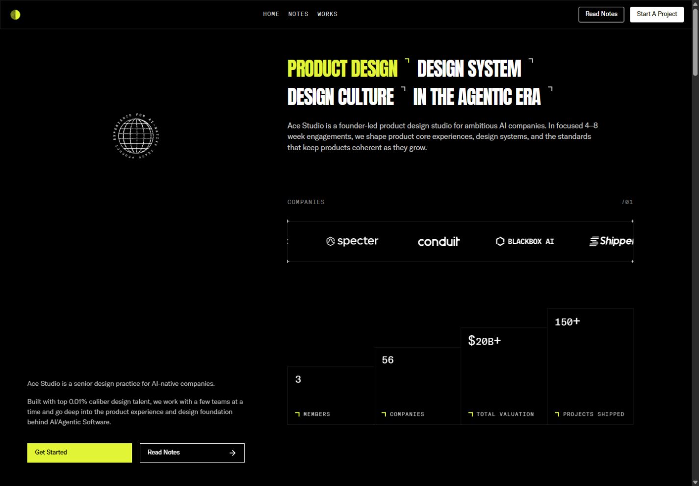
Ace desktop homepage with a fixed studio rail and scrolling project content.
Captured September 15–16, 2026. Image dimensions describe the saved files. Mobile research used a 390 × 844 CSS-pixel viewport; saved images may be resized. Each frame records one moment, not the complete animation.
The measured text begins at x=24 and extends beyond the screen. Its 16px type is a reasonable reading size; the container width causes the failure. Fixing that constraint comes before changing the visual direction.
The same review found Works leading to Notes in the mobile menu, a Lab link pointing to /404, and an empty direct Works route. A composed homepage still needs dependable destinations.
Audit inner widths and navigation after the outer layout changes.
Chapter 05 / Takeaways
Carry the discipline all the way.
The useful reference is Ace's consistency: restrained color, technical texture and stable project framing. Borrow that discipline across the whole experience. A clipped paragraph or unexplained destination can undo the confidence established by many carefully aligned details.
Give context a stable place beside the work.
Keep the fixed context where space supports it. On a smaller screen, provide a clear contact path near the work and let important proof use comfortable reading typography.
These priorities come from the September 15–16, 2026 observations and public-source inspection. They describe this review's evidence, without making a conversion, performance or accessibility certification claim.
Precision is the quality of the reading and navigation, too.
The reading room
Stay curious.
Go deeper.
Take the restraint. Apply it to every edge of the experience.
Based on research captured September 15–16, 2026. Interactive illustrations explain design principles; the linked reports contain the observations, screenshots, and source evidence.