Study 03 / Neue Montréal
The Typeface Becomes the Journey
A travel guide turns font features into places to explore, compare and understand.
Enter the story Five chapters. A different way of looking.Let’s follow it.
Chapter 01 / Idea
Open a specimen. Find a city.
Neue Montréal gives a type specimen the shape of a travel guide. A red cover leads into postcards, city stories, tickets and enormous letters. The editorial setting makes a long technical explanation feel like a sequence of discoveries with a shared destination.
The journey becomes progressively more specific: meet the family, explore its weights, compare optical styles, inspect glyphs and languages, then find the product. Each chapter answers a different question about the same typeface.
Printed textures and saturated chapter colors keep that structure lively. The strongest idea is the connection between the story being told and the product doing the telling.
Organize product education as a sequence of questions worth exploring.
Chapter 02 / Type
The letters are the evidence.
PP Neue Montreal and its Text family carry both the interface and the demonstration. Huge specimens show character; ruled columns explain the family. The hierarchy changes through alignment, density and scale, giving the same product several different ways to introduce itself.
- Font size
- 74.08px
- Line height
- 66.67px
- Recorded source family / weight
- PP Neue Montreal Bold 700
Compact .9 leading makes the title a single graphic block.
Desktop 74.08px → mobile 29.6px.
Measured at 1440 × 1000 desktop and 390 × 844 mobile, September 15–16, 2026. This scaled diagram uses the library’s PP Neue Montréal, not the source typeface. Its SVG units show twice the recorded size; on-screen pixels vary with the frame.
In the Story section, similarly sized columns remain legible because position and rules separate their roles. A new heading does not always need a louder size to be understood.
The measured explanatory style uses tight 1.0 leading and negative tracking, producing a printed texture. That density belongs to this specimen's purpose; sustained prose elsewhere may need more breathing room.
Use alignment and spacing to organize information before increasing its size.
Chapter 03 / Motion
Make the feature change in view.
Scroll changes weight. A split character exposes differences between optical styles. Punctuation alternates between constructions. Here, movement makes a font property visible, giving visitors something more useful than a claim that the family is versatile: an opportunity to see what versatility means.
Regular: open, even and quiet.
Original illustration using this library’s two installed PP Neue Montréal weights. The source specimen offers its own families and weight choices.
The main specimen updates; switching families changes the available weights.
Weight selection and the Display-to-Text switch were exercised live. Purchasing and license transactions were not tested.
Recorded September 15–16, 2026.The configured scroll specimen moves Display from 900 to 100 while Text moves from 200 to 700. These are actual variable-font settings, so the interaction demonstrates the product's design space.
Postcard tilt was observed, while source inspection explained its return behavior. The orbiting image component pauses offscreen and has no inspected drag handlers; its rotation should not be mistaken for a draggable gallery.
Choose an interaction that reveals a property of the product itself.
Chapter 04 / Mobile
Fold the guide a different way.
The city accordion keeps its color and weight concept while changing its geometry. Narrow vertical panels become stacked horizontal rows, making each place easier to select and read on a phone. The idea survives because its presentation is allowed to change.
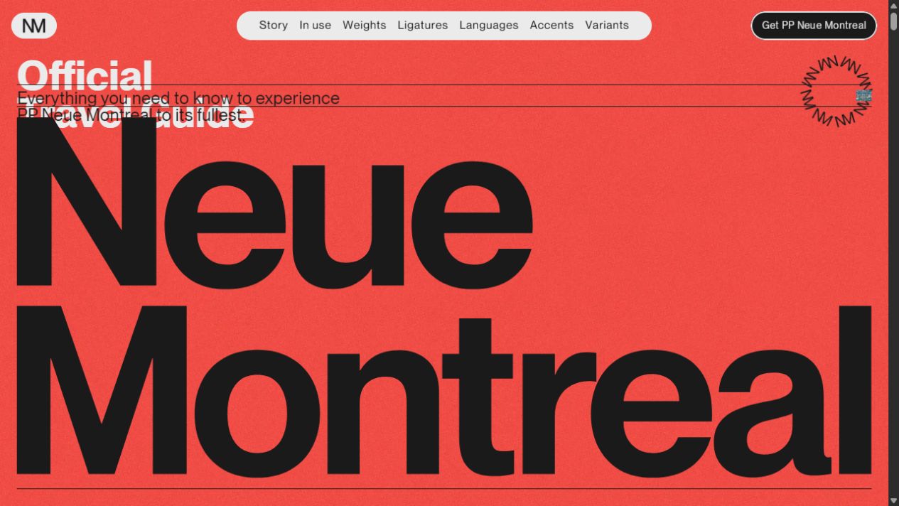
Neue Montréal desktop cover presenting the typeface as an editorial specimen.
Captured September 15–16, 2026. Image dimensions describe the saved files. Mobile research used a 390 × 844 CSS-pixel viewport; saved images may be resized. Each frame records one moment, not the complete animation.
The mobile Biosphere story opened successfully in the review. Ligature circles stack, postcard tilt is reduced, and selected comparisons remain paired because seeing both sides is part of their meaning.
Orientation becomes the tradeoff: the central chapter navigation disappears on a page measured at roughly 17,000px tall. A compact chapter menu would support return visits as well as leisurely scrolling.
Preserve the meaning of a comparison while changing how it fits and opens.
Chapter 05 / Takeaways
Make room for the return visit.
The first visit can be a journey. The second may be a search for one weight, comparison or glyph. Neue Montréal is a rich reference for serving both kinds of reader, provided exploration is paired with a direct route back to the useful detail.
Turn each product feature into something a visitor can inspect.
Keep the travel-guide structure and motion that demonstrates the typeface. Add mobile chapter access and verify keyboard behavior, focus and selected states for the custom specimen controls.
The September 2026 review captured cover overlap at 1280×720, while 1440×1000 resolved cleanly. That is a specific viewport finding with an undiagnosed cause, rather than a universal description of the cover.
A good product story also works as a useful reference.
The reading room
Stay curious.
Go deeper.
Let the product tell the story, and give every chapter an address.
Based on research captured September 15–16, 2026. Interactive illustrations explain design principles; the linked reports contain the observations, screenshots, and source evidence.