Lama Lama
A complete brand behavior system: typography, layered interactions, responsive behavior, and public-source evidence for Lama Lama.
Explore the story Five interactive chapters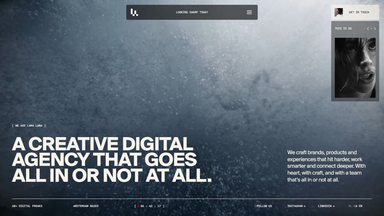
Lama Lama desktop homepage showing its agency typography and media-led composition.
Full size (new tab)Reviewed September 15–16, 2026 · Live website · Research findings
This page brings together the website review, typography follow-up, and public-source findings for Lama Lama. Observed behavior, source-confirmed implementation, hook-only findings, and interpretation remain distinct. Viewports and shared coverage limits are recorded in Reading this research.
Website review
Creative assessment. Lama Lama is the most extensive interaction system in this group. Its distinctive quality is not the number of effects: pixel treatment, mono scrambling, compact controls, contextual messages, media and presentation mode all feel related. It turns the agency's personality into a reusable interface language. The cost is complexity—users have to understand several overlapping modes. Live site
Typography, palette and layout
- Type: Suisse BP International across weights 300–700, paired with Sometype Mono. Large bold uppercase titles use tight tracking and line-height as low as .8. Body is more open, generally 14–16px at the regular token range; micro labels are 10px uppercase mono.
- Color: dark
#1a1c1c, off-white#f9f4eb, pink#ffc6da, red#e75d60, green#d0ff7eand pale blue#dcf2f4. Dark, light and pink theme mappings govern content, background and cursor treatments. - Header: a centered compact panel, maximum width 438px, holds the pixel logo, a changing contextual phrase and menu control. It is an interface object floating above the page, not a conventional full-width header.
- Composition: cinematic full-bleed hero media; large title lower left and supporting text lower right on desktop. Compact rows and broad media areas alternate below. Small utility cards float on the right.
Lama Lama desktop
Page sequence and secondary templates
The homepage moves from its media-led introduction to featured work rows, services, client logos, culture imagery and a contact close. Each work row pairs the project name and category tags with an image strip. On desktop, opening Neurons Lab expanded a gallery and narrative inside the page; dragging changed the visible media. This gives browsing depth before requiring a case-page visit.
The services section combines large type with lists of capabilities. Client logos add a quieter horizontal rhythm. Culture images use deliberately unequal sizes and offset placement. The footer repeats contact and scheduling with a recognizable person attached to the phone CTA.
The Work index expands this same system into 40 projects. Its floating filter tray is functional: selecting E-commerce changed the address to ?type=e-commerce, reduced the count to 6 and displayed matching rows. This is a strong detail because the filter has a persistent, shareable state. Filtered view
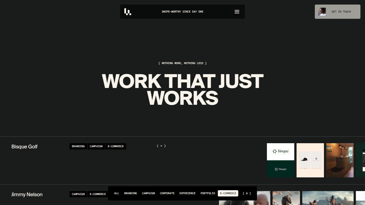 Lama Lama filtered work index: six E-commerce projects
The Moov case uses a large title, category tags, short narrative, credits and an extensive media sequence. Back to work stays available at the top. The inspected case family generally shares this structure and ends with related projects and contact. The source inventory covers all 41 English case sitemap URLs, including one redirect, so template reuse and exceptions are documented rather than inferred from one page.
Public source also shows dedicated light service templates with process stacks, related work and contact; About contains values, awards, team selection and a culture gallery. The AI route is sparse, with a title and standard close, while Cubby's case contains lorem ipsum in its primary narrative. These source-confirmed content gaps deserve an editorial pass. A duplicate /cases/10-10/ URL correctly redirects to /cases/10-out-of-10/; that redirect itself is not a broken experience. Route inventory
Hidden interfaces and motion
| Surface / trigger | What happens | Evidence |
|---|---|---|
| Menu | Compact panel expands over blurred content, with service submenu and inquiry actions | Observed |
| Our pitchdeck | Opens a separate ten-slide presentation with thumbnail navigation | Observed |
| Pitchdeck keyboard | ArrowDown advanced the desktop deck; thumbnail-list control exposed the slide index | Observed |
| Pitchdeck close | Explicit X works; Escape did not close it in the tested desktop state | Observed |
| Showreel utility | Opens custom full-screen video with seek, mute, pause and close controls | Observed; video playback verified |
| Work row, desktop | Inline case preview opens; gallery can be dragged | Observed Neurons Lab |
| Work row, mobile | Tested Ajax plus opened the dedicated case URL | Observed; materially different from desktop preview |
| Work filter | Updates matching rows, count and query parameter | Observed E-commerce |
| Start a project | Menu region transforms into a stepped form with progress and focused field | Observed first stages; not submitted |
| Scroll through chapters | Header phrase/logo state and utility cards change with context | Observed + source |
| Contact grid settings | Reveals adjustment surface around the pixel/video treatment | Observed opening; deeper camera flow source-only |
| Activate camera | Requests camera and renders its stream through the branded grid | Source-confirmed; deliberately not activated |
| Team list | Hover changes portrait, marks the row and reveals a personality caption | Observed in follow-up + source |
| Culture gallery | Desktop gallery moves horizontally | Source-confirmed, not fully exercised live |
| Awards image / mobile button | Desktop hold reveals awards; mobile button expands a persistent table | Desktop handler source-confirmed; mobile expansion observed in follow-up |
The deck is a genuine alternate way to understand the agency, not a PDF download. Source defines ten slides, arrow navigation and desktop wheel/vertical movement. Below 1000px, it changes to horizontal movement with swipe and left/right tap zones. I opened the mobile deck, but did not fully verify all touch navigation on a physical device. Its desktop X works; adding a reliable Escape behavior would align it with familiar modal expectations.
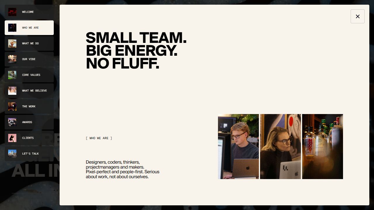 Lama Lama pitch deck and thumbnail navigation
The showreel's controls disappear after inactivity—source says 2 seconds on desktop and 4 on touch—and return on movement. Opening it pauses background rendering; closing mutes/pauses the video and restores the background. Actual playback was verified rather than treating generic fallback text in the DOM as a playback error.
The inquiry form asks project type, name, email, optional company and message. Next advanced beyond an unselected project type; it did not progress beyond an empty name in the tested state. I did not observe a clear inline error message in that moment. Public code includes focus/validation behavior, previous/cancel actions, Enter shortcuts and success/error panels. Submission outcomes are untested. The scheduling route uses an embedded Cal.com introduction calendar in source.
The Contact page is an additional discovery: a moving image is rendered through a fine grid, with camera activation and grid settings. Code maps the slider to grid size, supports dark/light colors and stops camera tracks on revert/destruction. The actual camera request was not made. An apparent missing DOM insertion in one error-message method is a source concern to test, not a confirmed user-visible failure.
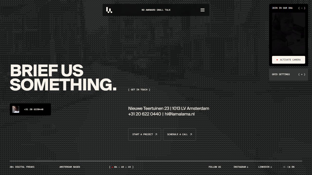 Lama Lama contact grid
The rendering system includes a shader that draws the LL logo, an 8px grid and a pointer distortion field that decays over time. Rich cursor behavior is disabled for touch or unsupported graphics capabilities. Button hover scales the backdrop to .98, swaps arrows and reveals mono text, mostly using .25–.45s power4.out. The shared stack system clips older cards as later cards arrive, with progress lines. These behaviors connect micro-interactions to the same visual language as the larger media transitions. Source details
Mobile changes and issues
The header becomes nearly full available width. The desktop floating contact utility is removed from the initial mobile composition, while the showreel access appears within the expanded menu. Hero title and body stack toward the lower portion of the tall screen.
Work rows become larger vertical units: title, tags and a horizontal image strip. Importantly, the tested Ajax plus went directly to /cases/ajax/, rather than reproducing the desktop inline expansion. Service columns become a horizontal strip of large outlined cards with a progress indicator; dragging from Branding to Digital worked. This is an intentional responsive behavior change, not accidental overflow.
The deck retains a full-height presentation treatment and close control at mobile width. Micro labels remain small. The menu, deck, showreel and form each have different states and exits, so a final interaction QA pass should cover back behavior, focus return, screen-reader naming and Escape consistently across them. No full certification is implied by the presence of accessibility-related code.
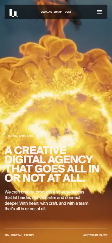 Lama Lama mobile
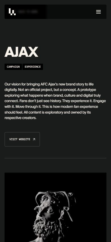 Lama Lama mobile case destination after Ajax plus
What I would keep: the shared pixel identity, compact menu hub, desktop inline previews, persistent filter URL and intentional mobile service strip. What I would change first: modal exit consistency, explicit field-error feedback and incomplete content. Then check whether the smallest mono labels remain comfortable on real phones and whether each hidden surface is discoverable without explanation.
Typography and pointer behavior
Type was sampled at 1440×1000 desktop and 390×844 mobile viewports. The table gives computed size / line height in CSS pixels. These are observed roles, not an exhaustive token specification or proof of a separate font file for each computed weight. Measurement method and limitations · Raw computed-style samples.
| Site and role | Typeface / weight | Desktop | Mobile | What the difference does |
|---|---|---|---|---|
| Lama hero headline | Suisse BP Intl 700 | 72 / 57.6 | 40 / 32 | .8 leading creates a dense, emphatic uppercase shape |
| Lama hero explanation | Suisse BP Intl 400 | 20.04 / 24.05 | 16 / 19.2 | Readable sentence rhythm contrasts with the tightly packed title |
| Lama mono action labels | Sometype 500 | 10 / 18 | 10 / 18 | Consistent instrument-like voice, but mobile labels remain very small |
Attention and reading order
The hero combines a cinematic environment with a dense uppercase declaration. The explanatory paragraph sits separately on desktop and directly below on mobile. The headline establishes attitude; the paragraph supplies the broader offer; the work and service sections provide specificity.
The portfolio rows are a compact information system: name → classification tags → visual samples → expand/open action. A visitor can assess many projects without first opening every case. Full cases then use narrative, credits and media in a more detailed sequence. This distinction between index and detail is one of the site's strongest organizational choices.
On About, names and roles are presented as a list rather than a grid of headshot cards. Hover reveals a full-page portrait and an informal personality caption. The list stays compact while the image supplies presence. The tradeoff is that portraits and captions are transient; they should remain supplementary to the stable names and roles.
Type and information density
The hero uses 72px type with 57.6px line height on desktop, and 40px with 32px line height on mobile. That .8 leading deliberately compresses the title into a solid block. The explanation uses about 20px/24px and 16px/19.2px respectively, giving sentences more room than headlines.
The desktop headline box is about 783px wide and its explanation about 322px. On mobile, they become 358px and 297px. This is a more complete responsive adjustment than shrinking the type alone: the reading measure and spatial relationship both change.
Mono labels remain 10px/18px with −.02em tracking. Brackets distinguish metadata; outlines, arrows and filled states distinguish actions. That consistency is attractive, but it places a lot of work on subtle shape cues because labels and actions often share the same small type treatment. I would preserve the mono voice while considering a larger mobile size for important actions.
Newly tested pointer details
- Hovering Lisa Stegers changed the background portrait, marked the active row and revealed “Professional problem solver” near the pointer.
- Moving to Tim Koree changed the portrait/row and the caption to “Climbs things. Builds things.” These are personalized discovery details, not generic cursor text.
- The Get in touch card swaps its label layers on hover, consistent with the site's shared mono-reveal button system. The empty hero was also probed; its constantly changing media makes it inappropriate to label every visible change as a cursor effect.
- The awards image revealed a Keep holding for glory instruction. Inspection of the actual awards module confirms that desktop mousedown shows the awards/description and mouseup hides them. A prolonged hold was not exercised through the available controls.
- On mobile, the same awards information has a View our awards button. I opened it and verified an expanded description and award table, with the plus changing to minus. This is a particularly good touch alternative: the user can read the information without maintaining a press.
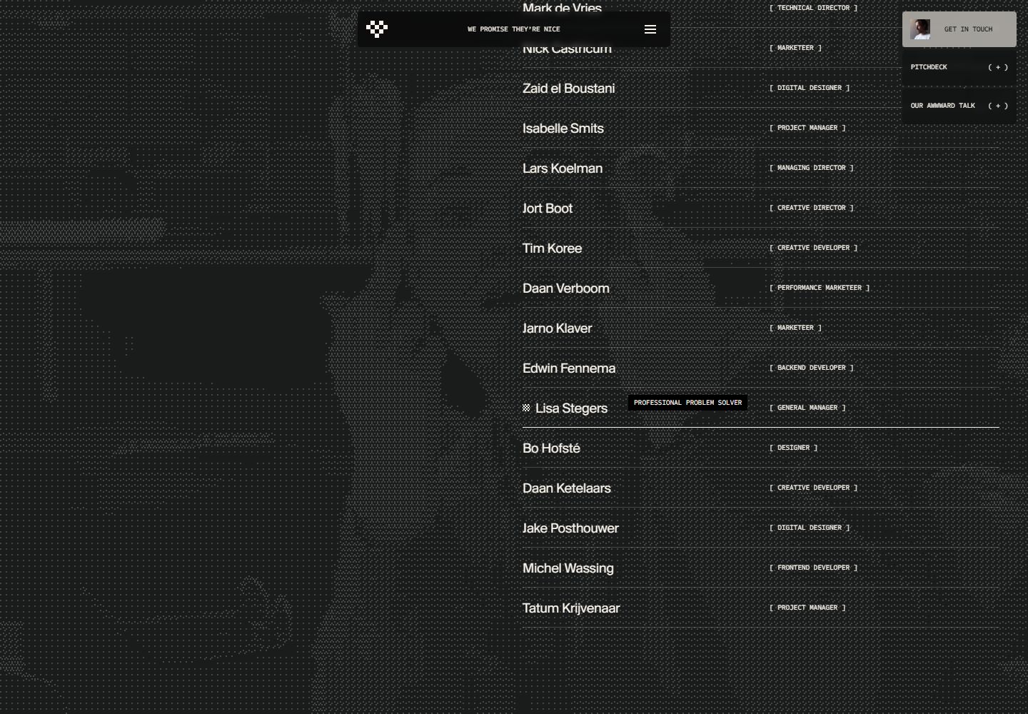 Lama Lama: a personality caption appears beside the selected team member
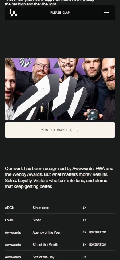 Lama Lama: mobile awards disclosure remains open for reading
The public awards module staggers award reveals by .035 seconds. Its mobile panel opens over 1.25 seconds and closes over .85 seconds. The key design distinction is the interaction model: temporary press-and-hold revelation on desktop, persistent disclosure on mobile.
Direction I would give the team: retain the index/detail structure and personalized team discovery. Use the awards adaptation as the standard for other hidden content: preserve the idea while giving touch users a stable, readable state. Treat small labels and modal exits as functional design decisions, not finishing details.
Public-source audit
These findings come from public HTML, CSS, JavaScript, and sitemaps. A shipped definition does not prove an active feature: configured means an invocation or page markup is present; implemented means its handler was inspected; hook only means the custom handler was unavailable. Source scope and limitations.
- Lama HTML: https://lamalama.com/; CSS https://lamalama.com/wp-content/themes/lamalama2025/dist/assets/main-xY9fs9fO.css?ver=7.1; app https://lamalama.com/wp-content/themes/lamalama2025/dist/assets/app-B43p2XC9.js.
Typography, grid and color
Custom WordPress theme lamalama2025, compiled with Vite-style modules. Typography is SuisseBPIntl 300/400/500/700 plus Sometype Mono declared as 400–700. Main app embeds its design configuration:
- Display: uppercase bold 700, tracking -.02em, line height .8; lg 72→128px, md 56→96px, regular 52→80px, small 48→72px.
- Heading 1 40→60px, bold uppercase/.8; heading 2 32→48px/.9; smaller headings 28→40, 24→32, 20→24, 18→20px.
- Body regular 14→16px/1.4; medium 16→20px/1.2; large 20→24px/1.2; XL 24→32px/1.25.
- Micro labels/buttons: mono 10px, uppercase, weight 500, line height 1.8, tracking -.02em. Navigation 16px/1.4; nav children 14px.
- Fluid sizes interpolate between 800 and a design width, then have a larger-screen regime. CSS uses
clamp; minimum/maximum numbers are token ranges, not measurements of a specific screenshot. - Breakpoint map: 350, 376, 600, 800, 1000, 1200, 1440, 1600px. Menu has a max width of 438px and is centered near the top, rather than a conventional full-width navigation bar.
CSS palette: black 0 0 0, white 255 255 255, dark 26 28 28 (#1a1c1c), red 231 93 96, green 208 255 126, pink 255 198 218, blue 220 242 244, off-white 249 244 235 (#f9f4eb). Theme map has dark, light and pink; it maps backdrop, content and cursor RGB independently. Theme module.
Actual interactions and hidden surfaces
- Brand-specific WebGL. Shader contains
drawLLLogo, an 8px grid, texture cover/pixelation, cursor vector-field distortion, reveal progress and parallax uniforms. Actual app creates canvas, backdrop, cursor and page component instances. The pointer field adds velocity with radial falloff and decays over time; the cursor shader stops updating after about 1.5s inactivity. Touch devices and unavailable WebGL/float-buffer support disable this richer cursor path. This is a substantive branded rendering system. - Hovering buttons. Actual button module registers mouseenter/leave only for non-touch. Hover scales backdrop to .98, swaps opacity, shrinks original arrow and grows replacement arrow, hides original text and runs a new mono text reveal. Most easing is power4.out, durations .25–.45s. This creates a tactile change rather than only changing a fill color. Button module.
- Menu overlay. Homepage contains
.js-menu, toggle, scroll container and blurred backdrop, plus.js-open-pitchdeck. This compact expandable hub contains deeper presentation/navigation options. - Pitch deck. Real homepage contains
.js-pitchdeck-container, slide list and thumbnail UI; main app creates a PitchDeck class. It opens through menu/sticky triggers and hash, pauses the background canvas, initially shows thumbnails then closes them after 2.5s. Arrow keys navigate. Desktop wheel/up-down scroll switches vertically; below 1000px it becomes horizontal, supports swipe and left/right tap zones. End slide reopens thumbnails. Transitions use expo.out with .4/.5s movement and .85s open/.65s close. This is a second presentation mode, not a normal PDF link. - Video/showreel modal.
.js-video-modal-containerand actual modal handler support#showreel, close, click video to play/pause, mute, seek bar, duration display. Mouse movement reveals controls; desktop controls hide after 2s (touch after 4s). Opens pause the background canvas; closing mutes/pauses/destroys the current video instance and resumes canvas. Implemented eases power4/power3 with .65–1.15s reveal timing. It is a custom player, not native browser controls. - Inquiry flow. Multi-step contact form has next/back/cancel, field focus/blur/change validation, progress, animated success/error overlays. Enter advances; textarea Ctrl/Cmd+Enter advances; arrow up goes back, arrow down advances. Source contains real submission code but no submission was made during research. Relevant for UX: errors/success shrink the overlay, rather than navigating away.
- Scheduling.
#calmaps to Cal.comlamalama/introduction, month-view layout. Booking trigger closes an open pitch deck first. Cal module. - Work filters. Actual filter class updates counts, animates filter tray from yPercent ±100/scale .96 to position/scale 1, and stores chosen filter in
?type=using replaceState. It reads that parameter on load;allremoves it. That supports shareable/filter-preserving navigation. These modules are linked for work page components, not asserted as visible on the home hero. Filter module. - Footer-triggered utility. Footer ScrollTrigger begins
bottom 110%, shows a sticky bar and updates header messages on entering, hides them on leaving. This means the header/footer has contextual states that a static first-screen audit would miss. Footer module.
Sitemap / section inventory
Sitemap index, pages, services, cases.
English pages: home, /work/, /about-us/, /contact/, /ai/; Dutch routes also exist. Services: branding, websites, ecommerce, marketing, with Dutch versions. Case sitemap contains many project pages. Homepage links include Moov, Gardeners, Neurons Lab, Voor Rookvrij, Prazeres United, Home Agency and Ajax. Careers link externally to Homerun; social links go to Instagram/LinkedIn. Source also includes language-switch component.
Director's interpretation and test priorities
The rendering system is unusually integrated: pixel/logo treatment, mono letter swaps, contextual chrome and layered content all reinforce one identity. The risk is discoverability and interaction cost: the compact menu, pitch deck, showreel, inquiry flow and calendar are different layers with different controls. Verify focus/escape/back behavior and readable small labels in-browser; the presence of an a11y module cannot certify accessibility. Dark/light/pink themes are designed mappings, not necessarily a user-selectable theme switch.
Route inventory
Public route responses and selected component code were inspected on September 16, 2026. HTTP 200 does not establish content completeness or working interactions. These tables are source findings, not a claim that every listed page or control was exercised live. Inventory scope and limitations.
Lama main pages and services
| Exact URL | Template / content structure | Novel interaction / detail | Status |
|---|---|---|---|
| lamalama.com/work/ | Hero basic → extensive case overview → contact/footer | Per-card expand/preview hooks, case/client links, shareable ?type= filters described in source audit | 200, populated |
| lamalama.com/about-us/ | Extended hero → agency intro → core-value stack → awards → team → culture gallery → footer | Awwwards talk/media; awards expansion; team portrait switching; horizontally scrolling media gallery on desktop, mobile gallery variant | 200, populated |
| lamalama.com/contact/ | Contact details, team/contact card, social/language links, project/calendar CTAs | Camera-to-WebGL-grid playground; adjustable grid, dark/light, revert; no camera activation tested | 200, populated |
| lamalama.com/ai/ | Basic AI title → standard contact/footer | No additional AI controls/content identified | 200, sparse/incomplete-looking |
| lamalama.com/services/branding/ | Light service template; positioning → video/media → testimonial → client logos → stacked process → related work → footer | Process items and stacked card progress; Next service path and repeated call booking | 200, populated |
| lamalama.com/services/websites/ | Light service template; positioning → motion media → testimonial → logos → process stack → related projects | Stacking cards; lacks separate blocks/process_item markup used by other services | 200, populated |
| lamalama.com/services/ecommerce/ | Shopify positioning → media → metrics → logos → four-stage process → related projects | Process cards, conversion-stat display; no testimonial_card component in this response | 200, populated |
| lamalama.com/services/marketing/ | Marketing positioning → media → metrics/testimonial → logos → six-stage process → related projects | Data/stat display, process stack; SEO/AI appears as a process stage here, despite sparse /ai route | 200, populated |
Novel component behavior verified from code
Contact camera/grid: The actual contact page instantiates VideoRoom. Camera access occurs through navigator.mediaDevices.getUserMedia({video:{...facingMode:'user'}}) when the user activates it. It hides contact text, shows settings, uses the stream as a shader texture and returns to contact if setup fails. Reverting stops every stream track and clears srcObject; destruction also calls stream cleanup. Grid slider sends value * 4 to setGridSize; thumb formula maps range 1–24, corresponding to 4–96 grid-size values. Dark/light controls update both shader colors and page/header theme. This is a specific exception to the main audit's caution that global theme mappings do not prove a sitewide user theme toggle. Camera module, settings module.
Potential error feedback issue, source-only: showError creates a div and assigns its text/class but does not append it to the page within that method. The user may not see the intended camera-error explanation. This needs a runtime denial test before calling it a confirmed UX defect; no permission was requested during this source audit.
Team portraits: About page's TeamMemberList uses the same 8px WebGL grid and transition layer as the brand system. Scroll triggers select the team member crossing viewport center; mouse hover can temporarily override the scroll-selected index, and leaving the list resets to it. Show/hide uses .75s power4.out. Team module.
Culture gallery: Gallery creates a scroll-scrubbed xPercent:0 → -100 media strip and synchronized progress bar. WebGL image/video rendering starts only within the relevant scroll interval, stops on leaving, and is killed/replaced by mobile behavior below 1000px. Gallery module.
Stacked values/process: Each stacked card gets a sticky offset, sequential scaleX progress bar, and clip-path masking as the next card arrives. Timeline is rebuilt on resize. Desktop hover may show contextual cursor text from the section's dataset. This is more than cards translating upward: older content is progressively clipped while the stack advances. Stacking module.
Lama case-study family
All English case URLs share hero_case → case_detail → other_cases_services → footer. Hero provides Back to work, title and category chips. Detail provides a short narrative, optional credits and external visit action, plus a media sequence using WebGL image/video components. Related cases reuse the same highlighted/item controls, followed by inquiry and scheduling CTAs. The distinction among case pages lies in content, media sequence and optional credits/actions rather than entirely new navigation patterns. No non-analytics iframe was present in the sampled HTML.
The following complete table records every English case sitemap URL. “Images + video” refers to component types in the primary case_detail region; it does not claim media loaded or played. “Credits” and “external action” refer to detail-region markup. This avoids counting the shared related-case videos as if they belonged to the case itself.
| Exact case URL | Content focus within shared case template | Detail variants / controls | Status |
|---|---|---|---|
| 10-10 | Film-production identity / portfolio | Images + video; external visit action (10outof10.tv) | Redirects to /cases/10-out-of-10/; final 200 |
| meadow | Personal communications product; brand / campaign | Images + video | 200, populated |
| seawater | Drinking-water brand; corporate / commerce | Images + video; external visit action (drinkseawater.com) | 200, populated |
| canals-and-windmills | Team-event brand / corporate | Images + video; external visit action (canalsandwindmills.com) | 200, populated |
| cubby | Branding case with placeholder narrative | Images + video | 200, lorem ipsum in primary narrative |
| mixr | Cocktail-on-tap branding | Images + video | 200, populated |
| bottleup | Reusable bottle brand; corporate / experience | Images + video; external visit action (bottleup.com) | 200, populated |
| knvb-commissie-mijnals | Anti-racism football organization; identity / campaign | Images + video; external visit action (commissiemijnals.nl) | 200, populated |
| 10-out-of-10 | Film-production identity / portfolio | Images + video; external visit action (10outof10.tv) | 200, populated |
| noodfonds | Local assistance organization; identity / corporate | Images + video; external visit action (noodfondsamsterdam.nl) | 200, populated |
| soilmates | Consumer products; campaign / commerce | Images + video; external visit action (soilmates.com) | 200, populated |
| behind-the-pines | Outdoor retailer; brand / commerce | Images + video; external visit action (www.behindthepines.eu) | 200, populated |
| moov | Fitness positioning / visual identity | Images + video; credits | 200, populated |
| van-doorne | Law firm; visual identity / website | Images + video; credits; external visit action (www.vandoorne.com) | 200, populated |
| one-studios | Music studio; digital experience | Images + video; credits; external visit action (onestudios.nl) | 200, populated |
| cinekidfestival | Children’s media festival; brand / campaign | Images + video; credits | 200, populated |
| steven-taylor | Photographer / creative director portfolio | Images + video; external visit action (www.steventaylor.com) | 200, populated |
| bruut | Film studio identity / portfolio | Images + video; recognition; external visit action (bruut.media) | 200, populated |
| jimmy-nelson | Photographer; campaign / commerce / portfolio | Images + video; recognition; external visit action (www.jimmynelson.com) | 200, populated |
| dorstenlesser | Social agency identity / portfolio | Images + video; recognition; external visit action (dorstenlesser.com) | 200, populated |
| sony-music | Music company; corporate / experience | Images + video; credits; external visit action (www.sonymusic.nl) | 200, populated |
| bmim-mima | Music-driven identity system; showcased generative tool | Images + video; generative identity described; no on-page tool control found | 200, populated |
| fledge | Film directors’ identity / portfolio | Images + video; external visit action (fledge.tv) | 200, populated |
| e-bike-store | E-bike retailer; brand / commerce | Images + video | 200, populated |
| ajax | Explicitly unofficial exploratory Ajax concept | Images + video; external visit action (iconsaremade.com) | 200, populated |
| storyboard | Agency identity / corporate / portfolio | Images + video; external visit action (www.storyboard-agency.com) | 200, populated |
| youngcapital-next | Career / traineeship corporate experience | Images + video; credits; external visit action (next.youngcapital.nl) | 200, populated |
| justdiggit-our-world | Environmental storytelling campaign / experience | Images + video; credits; recognition; external visit action (ourworld.justdiggit.org) | 200, populated |
| neurons-lab | AI consultancy; corporate / portfolio | Images + video; credits | 200, populated |
| home-agency | Creative agency; brand / corporate / portfolio | Images + video; external visit action (home.agency) | 200, populated |
| gardeners | Creative agency experience / portfolio | Images + video; external visit action (gardeners.nl) | 200, populated |
| bisque-golf | Golf lifestyle; brand / campaign / commerce | Images + video; credits; external visit action (bisquegolf.com) | 200, populated |
| monfri | Employer branding firm identity / corporate | Images + video; external visit action (mon-fri.com) | 200, populated |
| prazeres-united | Community football; brand / campaign / experience | Images + video; credits; external visit action (prazeresunited.com) | 200, populated |
| jack-and-ai | AI content agency identity / portfolio | Images + video; external visit action (jackandai.com) | 200, populated |
| hear | Music and sound agency identity / portfolio | Images + video; external visit action (hear.agency) | 200, populated |
| lelystad-city-branding | City marketing identity / campaign | Images only | 200, populated |
| 750-years-of-amsterdam | City anniversary digital campaign | Images only; credits | 200, populated |
| achmea-impact-ventures | Venture organization identity / corporate | Images + video; recognition | 200, populated |
| voor-rookvrij | Smoke-free movement identity / campaign | Images + video; credits; external visit action (www.rookvrijegeneratie.nl) | 200, populated |
| bvp | Investment organization identity / corporate | Images + video; external visit action (bvp.capital) | 200, populated |
Read across the collection
Research findings · Compare typography · Research methodology