Noho
Playful furniture, oversized type, and visible energy controls: a study of the Noho design concept and its responsive interface.
Explore the story Five interactive chapters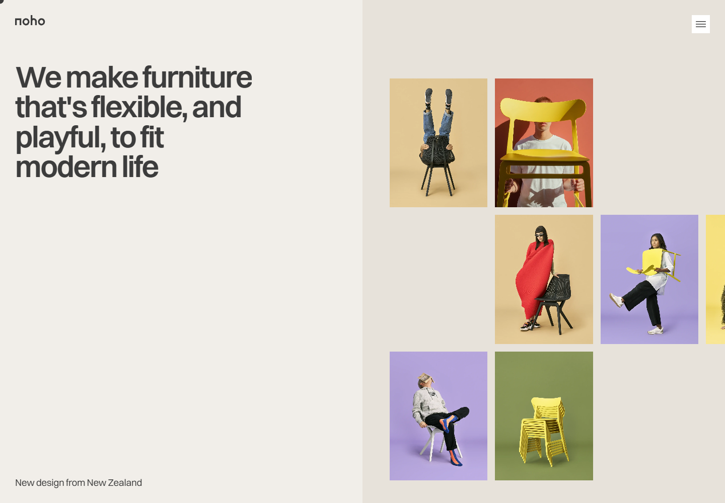
Noho at 1440 × 1000: large type and a staggered furniture image grid share a split hero.
Full size (new tab)Reviewed September 20, 2026 · Live concept · Explore the story
This study examines noho.ink, which identifies itself in its purchase disclosure as a design concept honoring the furniture brand. It is not a verified operating store. The footer credits Eugene More for the design; the concept disclosure attributes the imagery to noho.co. Screenshots below document the reviewed interface, with no affiliation or endorsement implied.
Website review
Creative assessment — interpretation. Noho makes furniture feel like something to live with and play with. Warm neutral panels give colorful photography room to lead: people lift chairs, sit unexpectedly, and use the object as a frame. A large, tightly set introduction occupies the left half of the desktop hero, while a staggered image grid occupies the right. The contrast is between a steady statement and a less orderly demonstration of character.
The strongest connection is between the sustainability narrative and a visible energy panel. A brand position becomes a choice within the interface. That is a useful design principle even though neither the panel's rating nor its battery-saving claim was independently measured.
Noho desktop hero at 1440 × 1000: large left-aligned type beside a staggered grid of colorful furniture photography, captured September 20, 2026.
Page sequence and intent
The homepage contains the introduction, a materials narrative, two product presentations, environmental claims, lifestyle imagery, customer stories, a quiz and inquiry area, company profiles, awards, editorial cards, FAQ, a chair playground, social links, and newsletter/contact details. This is a single long reading path with multiple interactive layers. The header's About, Price, Blog, and FAQ links point to sections within that path.
The product area places large chair views above names, prices, color choices, and actions. This makes the object the primary explanation and keeps shopping cues compact. The visible prices and shipping statements are content in a concept interface, not verified commercial availability.
Observed: selecting the first product's Buy action opened a centered concept disclosure over the product scene. It explained the nature of the site and credited the original imagery. This is meaningful behavior behind a #none link; the fragment alone would not establish a broken purchase button. No purchase or business form was submitted.
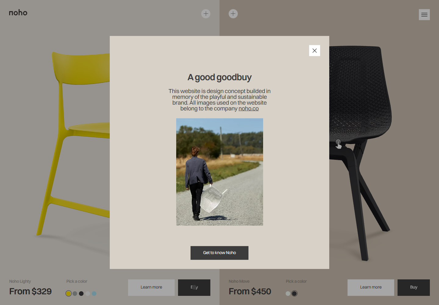 Noho Buy disclosure at 1440 × 1000: a centered panel identifies the website as a design concept above the dimmed chair presentation.
Style map
| Theme | Observed treatment | Interpretation |
|---|---|---|
| Type | Switzer in regular and semibold roles; tight large headlines | One family keeps expressive and practical text related |
| Color | Warm off-white and stone surfaces; yellow, lilac, red, and green in images | Quiet interface color gives the furniture photography priority |
| Layout | Split desktop hero, staggered image grid, large product panels | Alternates a clear statement with exploratory looking |
| Navigation | Compact burger expands into section links; separate energy controls | Small interface objects leave room for the editorial composition |
| Proof | Material claims, testimonials, awards, and editorial cards | Several kinds of reassurance surround the product, but remain site claims |
Typography and pointer behavior
Computed CSS was sampled in Chromium at 1440 × 1000 desktop and 390 × 844 mobile on September 20. Values below are exact browser-reported CSS pixels, including fractional responsive values. They are not a complete token inventory. Raw measurements include selectors, computed weights, tracking, and element widths.
| Site and role | Typeface / weight | Desktop | Mobile | What the difference does |
|---|---|---|---|---|
| Noho hero | Switzer 600 | 60.048 / 60.048 | 60.6684 / 57.635 | Keeps the headline large while changing its line breaks and composition |
| Noho section heading | Switzer 600 | 60.048 / 60.048 | 51.9987 / 49.3988 | Gives section openings a smaller but still emphatic mobile scale |
| Noho supporting line | Switzer 400 | 18.72 / 18.72 | 16.2513 / 16.2513 | Preserves a quieter reading voice below the headline |
| Noho energy note | Switzer 400 | 10.512 / 10.512 | 16.2513 / 16.2513 | Enlarges explanatory utility text in the narrow energy panel |
Attention and reading order
The hero remains approximately 60px at both measured widths. Its mobile adaptation comes from different line breaks and stacked regions, rather than uniformly shrinking the desktop page. Desktop hero tracking measured −2.40192px; mobile measured −2.42674px. The tightly joined lines make the headline read as a single visual mass. This is an interpretation of hierarchy, not an eye-tracking result.
The hero's visible lines are paragraph elements with an h1 class. The inspected document had no semantic h1. Section titles use h2 elements. A strong visual title therefore does not automatically establish an equivalent document outline. The browser font set reported loaded Switzer faces at weights 400 and 600; a variable-face declaration was also present but unloaded at inspection time.
The energy controls are clickable section elements with a data-control attribute and tabIndex of −1 in the inspected DOM. Their labels are adjacent paragraphs. Pointer operation worked, but this markup does not provide native switch semantics or ordinary keyboard focus. A production adaptation should use named buttons or checkbox controls with a programmatically exposed state.
Energy controls and interaction evidence
Observed: opening the desktop menu exposed a horizontal navigation strip. Opening Energy usage revealed two switches. Dark mode changed the warm light surfaces to dark brown and cream. Enabling both options changed the displayed rating to Low. The manual reduced-animation choice survived a navigation back to the homepage at mobile width, where the remaining single preference produced a Med rating; it was then turned off for the default mobile capture.
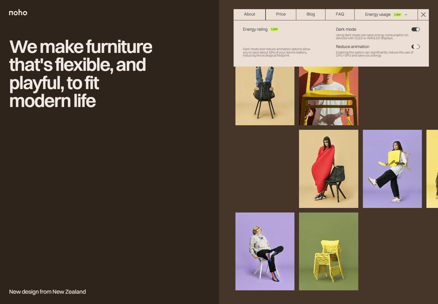 Noho energy panel at 1440 × 1000 with dark mode and reduced animation selected: the displayed rating reads Low. This screenshot records interface state, not measured power consumption.
| Trigger / surface | Recorded result | Evidence and boundary |
|---|---|---|
| Desktop burger | Opens a compact horizontal section-navigation strip | Observed pointer action |
| Energy panel | Exposes dark-mode and reduced-animation switches | Observed on desktop and at mobile width |
| Dark-mode switch | Changes the page palette; can be reversed | Observed pointer action |
| Reduced-animation switch | Changes switch/rating state; preference survives navigation | Observed state; public source confirms animation-reduction handlers |
| First product Buy | Opens the concept disclosure over the chair scene | Observed; no checkout or payment attempted |
| Mobile burger | Opens a broad menu with product imagery and section/social links | Observed at 390 × 844 |
| Product colors, model rotation, quiz, article cards, FAQ, and forms | Controls or content are present | Deeper operation and completion untested |
The energy panel claims approximately 35% battery savings. This review did not measure battery drain, CPU/GPU work, or energy use. The High/Med/Low indicator is an interface state, not a measured device reading. It should not be repeated as a performance result.
Mobile composition
At 390 × 844, the hero becomes a text-first stack. The logo, energy entry, and burger share a full-width top strip. The supporting line sits below the headline, and the image grid begins beneath the text area. The desktop's parallel introduction becomes a sequential one, preserving large type and the playful photography.
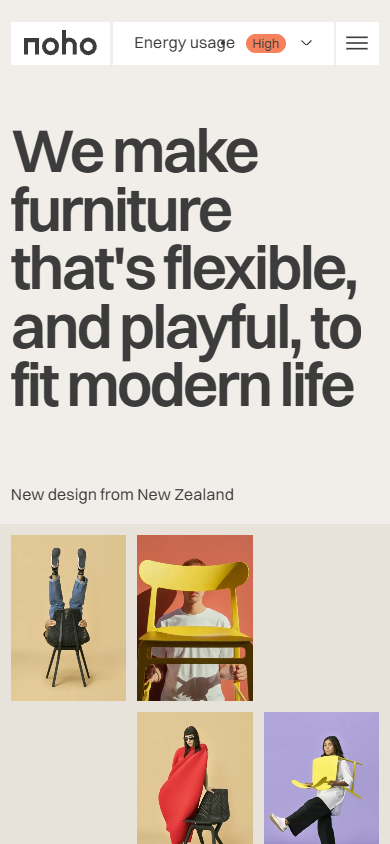 Noho mobile hero at 390 × 844: the header exposes Energy usage beside the burger, the headline remains large, and the photography starts below the introduction.
The open mobile menu gives product imagery and names a prominent place beside the navigation options. This is a materially different composition from the desktop strip. The energy explanation also increases from roughly 10.5px to 16.3px, showing that utility content has its own responsive treatment.
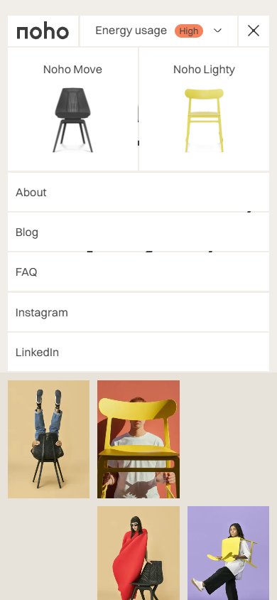 Noho mobile menu at 390 × 844, captured September 20, 2026: product imagery accompanies section and social navigation.
These are browser viewports with pointer input, not physical-phone or touch tests. Short-viewport behavior, screen readers, focus trapping and return, Escape across overlays, native reduced-motion preference handling, and every product interaction remain unverified. The library's story demonstrations use native controls and are original teaching illustrations, separate from these source captures.
Public-source audit
The inspected page references local copies of GSAP, ScrollTrigger, SplitText, Lenis, Embla, and model-viewer. A script reference proves availability, not that every possible feature is active. The public main bundle contains explicit handlers for data-control switches. Theme selection uses localStorage under theme; animation reduction uses nohoReduceAnimations. Its reduction path stores the preference, snaps registered reveal animations, and invokes registered reduction handlers; restoration clears that preference and invokes restoration handlers.
Those implementation details support the presence of a manual reduction mechanism. They do not prove that every animation stops or that the operating system's reduced-motion setting is honored. The live test verified the control state and persistence, without benchmarking the renderer.
Route and coverage ledger
| Surface | Coverage on September 20 | Limit |
|---|---|---|
https://noho.ink/ | Direct load; desktop and mobile hero, menus, energy panel, product Buy disclosure | One homepage template |
| Header destinations | DOM links to #about-section, #product-section, #blog-section, #faq-section | Not separate page-template audits |
| Product and editorial actions | Several links use #none; first Buy resolved to a working concept overlay | Other handlers not inferred from that result |
| Public scripts | Main bundle inspected for preference storage and reduction handlers | No private repository or complete source audit |
| External brand, awards, and social sites | Link targets inventoried | Destinations and underlying claims not audited |
Takeaways and test priorities
Keep: the relationship between product character and photography, generous product views, the large mobile headline, and a visible way to choose a calmer experience. The energy controls give an abstract brand value a concrete interface expression.
Improve first: make the concept status clear before a purchase action; use semantic headings and keyboard-operable switches; describe the energy rating as a preference indicator unless backed by measurements. Align retained commercial copy with the concept disclosure: the editorial content describes a store closure while the FAQ still describes shipping. This is a content-consistency issue within the concept, not a finding about the brand's current operations.
Verify next: system reduced motion, keyboard entry and exit for each overlay, selected color announcements, model-viewer fallbacks, and the quiz's complete progression. None of those outcomes is established by screenshots or loaded libraries.
The transferable lesson is to connect a brand promise to a useful choice, then make the choice understandable and accessible. This September 20 study is separate from the earlier five-site comparison; its measurements do not retroactively change that report's scope.