Arkon Digital
A portfolio as a real-time scene: typography, 3D interaction, responsive behavior, and public-source evidence for Arkon Digital.
Explore the story Five interactive chapters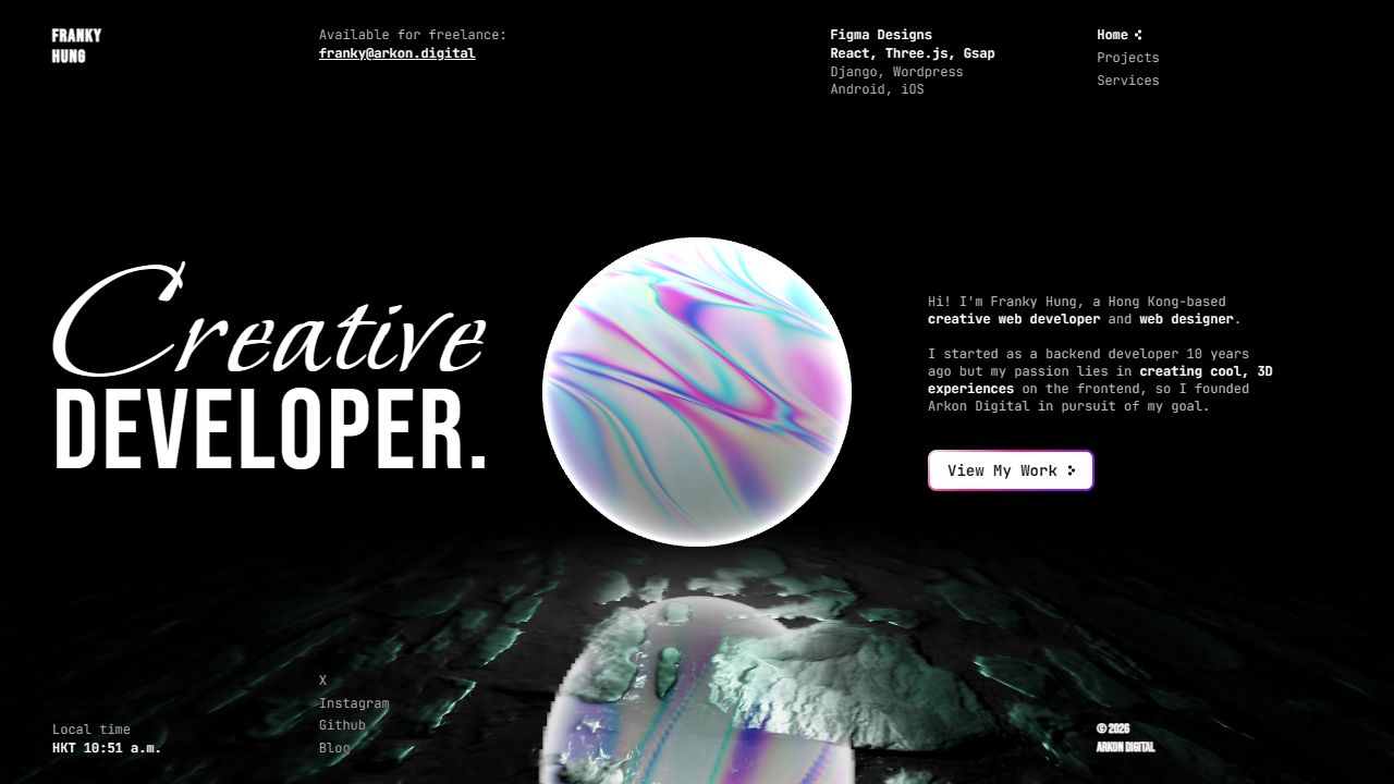
Arkon Digital desktop homepage with a central 3D sphere, large role title, and biography.
Full size (new tab)Reviewed September 15–16, 2026 · Live website · Research findings
This page brings together the website review, typography follow-up, and public-source findings for Arkon Digital. Observed behavior, source-confirmed implementation, hook-only findings, and interpretation remain distinct. Viewports and shared coverage limits are recorded in Reading this research.
Website review
Creative assessment. Arkon immediately establishes creative-development capability by making its hero a functioning 3D composition. The object, reflective ground and type contrast create a distinctive signature. Its best decision is maintaining that world across routes. Its weakest decision is allowing the world to compete with information at narrow widths. Live site
Typography, palette and layout
- Type: JetBrains Mono for technical prose/navigation; Bonheur Royale for the large flowing “Creative”; Bebas Neue for the condensed uppercase “Developer” and identity details.
- Color: black environment, gray
#b9b9b9body text, white emphasis; iridescent cyan/magenta/violet come from the rendered object. The main white CTA has a pink/purple edge. - Desktop layout: a full-viewport stage, large title left, central hovering sphere, biography and CTA right. Small metadata runs along the top; social links and Hong Kong time occupy the lower edges.
- Hierarchy: the unusual font pairing and sphere are equally strong focal points. The biography is intentionally subordinate, but it must still be legible.
Arkon desktop
Routes and interactions
The Projects route retains the scene but changes it to a blue particle sphere alongside the content. Recent and past projects have separate gallery controls. Each project combines explanatory text, technical labels, a large image and thumbnails. I clicked a secondary Modern Interior thumbnail and saw the large image change, then used Next Project to reach Lost in Boids. Previous is disabled at the first item. Pagination dots offer another route through the collection.
The Services route relocates the particle composition and displays rows of outlined service/technology chips. Their pill styling suggests possible action, but the inspected items were text rather than controls. That makes the interface slightly ambiguous: either style these unmistakably as labels or provide meaningful interaction.
| Trigger | Response | Evidence | Design assessment |
|---|---|---|---|
| Home → Projects/Services | Solid sphere yields to particles; composition shifts | Observed + source | Excellent continuity between pages |
| Pointer movement | Lighting target responds subtly | Source-confirmed | Adds depth without requiring a separate cursor toy |
| Thumbnail click | Replaces the primary project image | Observed | Conventional, understandable gallery behavior |
| Next/previous/dot | Changes selected project | Observed controls; next exercised | Useful inside a compact portfolio |
| Link hover | Arrow appears, text strengthens | Source-confirmed | Clear micro-feedback |
| CTA hover | Scale increases to 1.05 | Observed in follow-up + source | Simple tactile emphasis |
The scene uses React Three Fiber, a shader sphere, particles, lights and a reflective ground. Source shows pointer interpolation of a spotlight, so this is not simply an autoplay video. Route changes combine roughly .5s page fades with 1.5s particle transformations using power2.inOut. Lenis uses lerp .1 and duration 1.5, with smooth touch scrolling disabled. The circular loading treatment develops into a glow before fading. These code settings explain intent; loading time and frame rate were not benchmarked. Source details
External Live Demo destinations advertise further experiments. They are separate sites and were not tested as part of the Arkon interface audit.
Mobile changes and issues
The three navigation links remain visible rather than becoming a hamburger. Availability, technology columns and the clock are removed. The hero title moves up; biography and CTA move lower; the sphere occupies much of the center. Projects stack text before media, retaining thumbnails, dots and smaller arrow controls.
Observed readability problem: white body text crosses the brightest part of the moving sphere. The changing surface makes contrast unstable. The reflection also competes with lower social/footer text. A quiet scrim or an explicit text zone would preserve the spectacle while protecting reading.
Source-confirmed accessibility concern: the viewport declares user-scalable=no and a maximum scale of 1. That restricts intended zoom behavior, although actual browser enforcement varies. Remove the restriction and test zoom/reflow. The persistent canvas should also have a lower-motion/lower-cost mode; no claim is made here that it currently lacks every such mechanism.
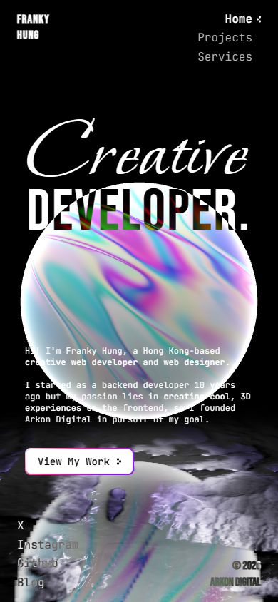 Arkon mobile: text over bright 3D content
What I would keep: the route-aware shared scene and distinctive font contrast. What I would change first: mobile text placement, zoom restrictions and label/control differentiation. I would evaluate performance on ordinary phones before adding another visual effect.
Typography and pointer behavior
Type was sampled at 1440×1000 desktop and 390×844 mobile viewports. The table gives computed size / line height in CSS pixels. These are observed roles, not an exhaustive token specification or proof of a separate font file for each computed weight. Measurement method and limitations · Raw computed-style samples.
| Site and role | Typeface / weight | Desktop | Mobile | What the difference does |
|---|---|---|---|---|
| Arkon “Creative” | Bonheur Royale 400 | 161.54 / 80 | 121.15 / 80 | Script ascenders/descenders visually interlock with the following line |
| Arkon “Developer” | Bebas Neue 400 | 107.69 / 107.69 | 80.77 / 80.77 | Condensed capitals keep a forceful title within limited width |
| Arkon biography | JetBrains Mono 400 | 12 / normal | 12 / normal | The explanatory text remains small even when the mobile navigation grows |
| Arkon navigation | JetBrains Mono 300, active/hover emphasis | 12 / 16.8 | 16 / 22.4 | Mobile route links are easier to target/read than the biography |
Attention and reading order
The central sphere and the large role title compete for first attention. The biography sits to the right as a compact explanation, with a bright rectangular CTA below. Availability, technologies, time and social destinations occupy the perimeter. This resembles an exhibition label around a central object more than a conventional marketing page.
That is a coherent strategy for a creative developer: the sphere demonstrates a capability before the prose describes it. It is less efficient for visitors trying to answer a practical question such as which services are offered or how to contact the developer. Those answers depend on small peripheral text or entering another route.
Type and hierarchy
The script's approximately 162px size is over thirteen times the biography's 12px size. “Developer” is about nine times that body size. Such a large jump makes the role memorable but heavily subordinates the explanation. The 80px line box under the taller script allows the two title styles to overlap visually as a deliberate lockup; it would be unsuitable as a general paragraph recipe.
JetBrains Mono gives the small information a consistent technical voice. Bold phrases within the biography identify the role and creative focus, so the paragraph has a scan path rather than one uniform texture. The right-side text block is about 320px wide in the mobile sample.
The mobile adaptation is revealing: route navigation increases from 12px to 16px, but the biography stays 12px. That is a local responsive decision, not a general increase in body size. Combined with the bright sphere behind it, the biography remains the weakest reading element. I would raise its size and provide a stable background before enlarging any other element.
Newly tested pointer details
- View My Work reached a live 1.05 scale on hover. Its bright fill makes the response easy to associate with the primary action.
- Hovering Projects strengthened the text toward white/600 and brought its arrow into view. Intermediate computed values showed the transition in progress; this was triggered without navigating.
- The pointer was moved across the wider scene. Its ambient movement makes frame comparison insufficient to isolate the lighting response. The spotlight interpolation remains supported by inspected code, not claimed as a separately proven visual effect in this pass.
- Several navigation/CTA elements are anchor-shaped DOM elements but were exposed as plain text in the inspected accessibility snapshot. This is a concrete reason to check href/role and keyboard activation; visual button treatment alone does not establish accessible link semantics.
Direction I would give the team: maintain the exhibition idea, but let practical information survive without competing with the exhibit. The 3D object can remain dominant while biography, contact and route controls have reliable contrast and semantics.
Public-source audit
These findings come from public HTML, CSS, JavaScript, and sitemaps. A shipped definition does not prove an active feature: configured means an invocation or page markup is present; implemented means its handler was inspected; hook only means the custom handler was unavailable. Source scope and limitations.
- Arkon HTML: https://arkon.digital/; application https://arkon.digital/index.9bd9d15c.js; CSS https://arkon.digital/index.eaed5af2.css.
Typography, layout and color
The page imports JetBrains Mono variable 100–800 with italics, Bebas Neue, and Bonheur Royale from Google Fonts. Body font is JetBrains Mono; .bonheur assigns the script to “Creative”, .bebas assigns the compressed display to “Developer.” and branding. Body foreground is #b9b9b9 over black; emphasis is white. Text uses difference/exclusion blend modes against the 3D scene.
The main overlay uses 24px 48px padding, dropping to 16px 24px below 768px, with max width 1820px. Home metadata grid is 1fr 2fr 1fr 1fr with 20px gaps. Columns use 12px/140% text, weight 300. Below 600px it becomes two columns, hides the second/third columns, increases small text to 16px, hides the Hong Kong clock, and reveals socials in the brand column. The “Creative” line has clamp(120px,106.1538px + 3.8462vw,180px); “Developer” has clamp(80px,70.7692px + 2.5641vw,120px).
The hero shifts composition below 1024px: display toward the top, biography toward the bottom. It is not merely a shrunk desktop canvas. However, the HTML viewport explicitly sets user-scalable=no, minimum-scale=1, maximum-scale=1; that is an accessibility concern for pinch zoom. Body overflow is hidden and a custom scroller is installed.
Actual interaction architecture
- Persistent React Three Fiber scene. Main renderer sets a camera with fov 60, near .1, far 100, position
[0,1.2,4.5]. A black fog scene contains a shader sphere, particles, spot and point lights, and a reflective ground. Actual scene logic reads pointer x each frame to lerp a spotlight target; it is genuine subtle pointer reactivity, not just a video backdrop. - Route-driven morph.
/restores the sphere and ground./projectsshifts the canvas toleft:100%;/servicesshifts it toleft:0. It fades the sphere's shader opacity and enables a point-cloud sphere, animating position/rotation over 1.5s withpower2.inOut. Further transitions use a short in/out push. That shared scene ties the routes together. - Loader. A circular progress ring is drawn with a conic gradient and animated
--degree; completion adds outer/inset glow, then fades the loader for 1.5s after scene loading. It is a branded transition, with potential waiting cost that should be assessed in-browser rather than inferred as actual slow loading. - Link hover. Navigation/social arrows begin 10px offset and invisible; hover brings them in, makes text white/600, using .3s ease. The main CTA scales to 1.05 on hover and uses a white fill plus pink/purple gradient border.
- Page changes. Framer Motion route wrapper fades in/out at .5s; Lenis settings include lerp .1 and duration 1.5, smoothTouch false. OverlayScrollbars appears in actual initialization, not only a bundle definition.
- Projects. Actual Swiper instance uses previous/next buttons and clickable pagination dots; buttons disable at endpoints. Inside a project, clicking a thumbnail changes the active large image. “Live Demo” opens external URLs. Separate Recent Projects and Past Projects galleries appear.
- Clock. Homepage HKT and copyright year update every 60 seconds. This adds operational/personality detail without requiring user interaction.
Routes / scope
Actual route declarations: /, /projects, /services, wildcard 404. /sitemap.xml returned the SPA shell rather than an XML sitemap. External project demos include modern interior, fish schooling, infinite world, wavy cubes, room shadows, stylized sun, water caustics, winter lake, miniroom, photography portfolio, diamond configurator, museum, earth and more. Their descriptions mention rich interactions, but those are separate project demos and were not verified by this source audit. Do not report their advertised behavior as something performed on Arkon's main homepage.
Read across the collection
Research findings · Compare typography · Research methodology