Study 02 / Arkon Digital
A Portfolio With Its Own Gravity
One persistent scene turns a developer's capability into something you can move through.
Enter the story Five chapters. A different way of looking.Let’s follow it.
Chapter 01 / Idea
Enter the demonstration.
A hovering sphere takes the center. A large role title stands to the left, a compact biography to the right, and small details occupy the edges. Arkon arranges a portfolio like an exhibition, with the work of creative development already happening in front of you.
The reflective ground and shifting color give the object a place to inhabit. The scene makes the claim of creative-development capability tangible before the visitor reads a project description.
Its strongest structural decision is continuity. Projects and Services stay inside the same world, changing the object and composition as the visitor changes routes.
Make the central idea demonstrate something you want the visitor to believe.
Chapter 02 / Type
The title performs a duet.
Flowing script and compressed capitals divide the role into two distinct gestures: Creative and Developer. JetBrains Mono gives the surrounding facts a quieter technical voice. The contrast is memorable, but it leaves the practical explanation working at a much smaller scale.
- Font size
- 161.54px
- Line height
- 80px
- Recorded source family / weight
- Bonheur Royale 400
Script ascenders/descenders visually interlock with the following line.
Desktop 161.54px → mobile 121.15px.
Measured at 1440 × 1000 desktop and 390 × 844 mobile, September 15–16, 2026. This scaled diagram uses the library’s PP Neue Montréal, not the source typeface. Its SVG units show twice the recorded size; on-screen pixels vary with the frame.
At the measured desktop viewport, the script was about 162px, Developer about 108px and the biography 12px. The tight script line box lets the title interlock as a deliberate graphic composition.
That hierarchy suits the exhibition idea, but the biography carries essential context. It needs its own clear reading space even when the title and sphere remain the main attraction.
Strong contrast needs a readable bridge between the spectacle and the explanation.
Chapter 03 / Motion
Change the scene, keep the world.
Navigation changes the composition instead of abandoning it. The solid sphere gives way to particles, and the scene shifts around the new content. This gives movement a structural role: it helps three routes feel like parts of one continuous portfolio.
Home holds a solid form at the center.
Original illustration of scene continuity. This diagram is not Arkon’s renderer or a reconstruction of its timing.
The solid sphere yields to particles and the composition shifts.
The route transition was observed and its implementation inspected. The 1.5s particle transformation is a configured duration, not a performance benchmark.
Recorded September 15–16, 2026.The research observed the scene changes and exercised project thumbnails and Next Project. Familiar gallery controls anchor the more expressive environment in ordinary, understandable actions.
Public code explains the React Three Fiber scene, pointer-linked spotlight and configured 1.5-second particle transformations. The lighting response was not isolated reliably in the visual test, and frame rate was not benchmarked.
Use motion to explain the relationship between places in the interface.
Chapter 04 / Mobile
Leave a quiet place to read.
The mobile composition moves the title upward and the biography downward, while the sphere keeps its central presence. That is a deliberate rearrangement. The trouble begins where white body text crosses the object's brightest surface and its contrast changes with the scene.
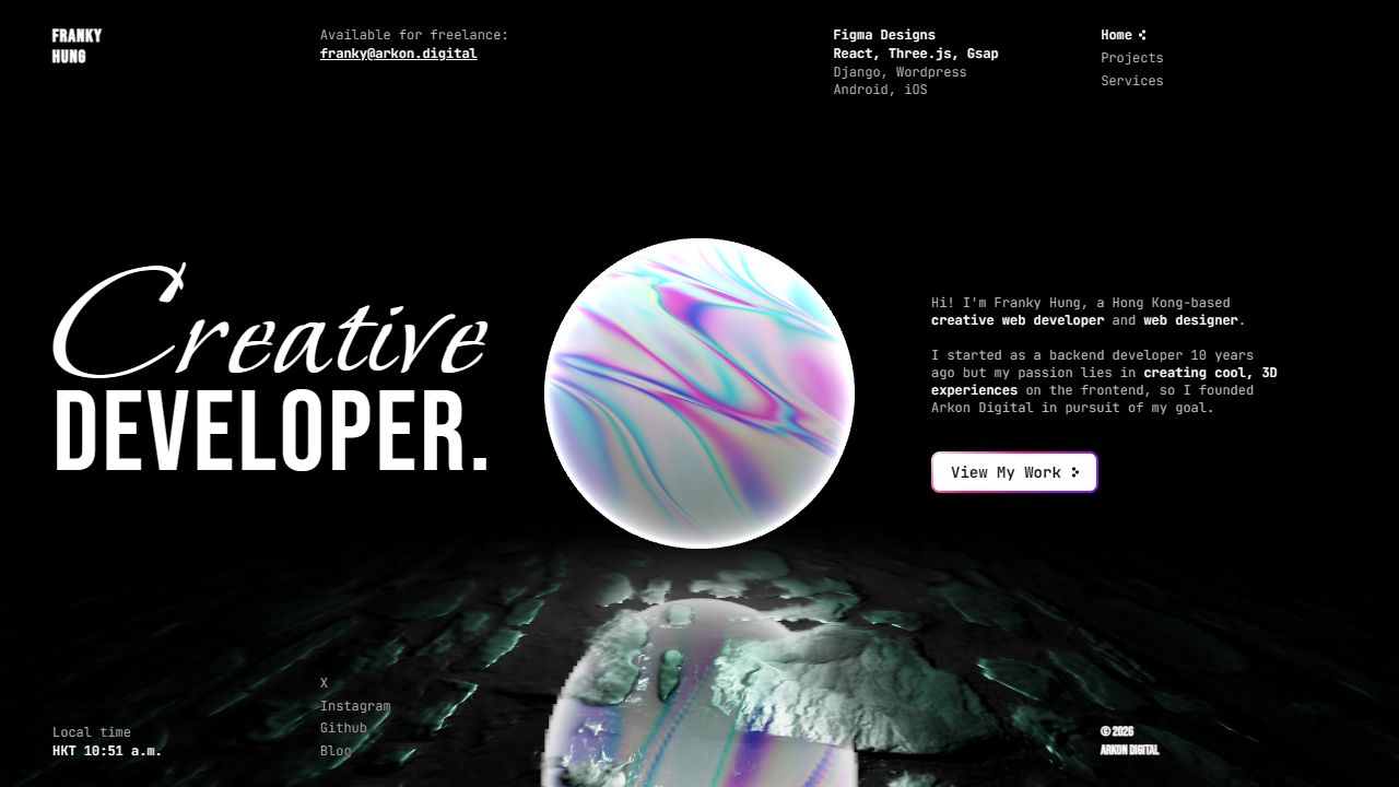
Arkon Digital desktop homepage with a central 3D sphere, large role title, and biography.
Captured September 15–16, 2026. Image dimensions describe the saved files. Mobile research used a 390 × 844 CSS-pixel viewport; saved images may be resized. Each frame records one moment, not the complete animation.
Navigation grows from 12px to 16px in the measured mobile view, but the biography stays at 12px. A stable background and a stronger reading size would protect the information without removing the object.
The source also contained zoom-restricting viewport settings. The review recommends allowing zoom and testing reflow, plus checking the persistent scene on ordinary phones; it did not measure actual device performance.
Reserve text-safe space inside an expressive composition.
Chapter 05 / Takeaways
Let the exhibit support the visit.
Arkon shows how a portfolio can make a skill visible through its own construction. The next design challenge is practical: help the visitor understand the offer, browse the work and reach the primary action while the scene remains the signature.
Use a shared scene to connect separate routes.
Keep the shared world and the contrasting title voices. Give the biography reliable contrast, distinguish service labels from controls, and check link semantics and keyboard activation alongside their visible hover treatment.
This interpretation draws on the September 2026 main-site review. External Live Demo projects were outside the audit, so their advertised interactions are not additional proof of behavior tested here.
A memorable setting works best when the visitor can still find the way.
The reading room
Stay curious.
Go deeper.
Build the world, then give the visitor a clear place within it.
Based on research captured September 15–16, 2026. Interactive illustrations explain design principles; the linked reports contain the observations, screenshots, and source evidence.