Study 04 / MONOLOG
A Conversation in Changing Light
Warm surfaces, personal context and a deliberate reading rhythm make a studio's offer feel human.
Enter the story Five chapters. A different way of looking.Let’s follow it.
Chapter 01 / Idea
Let the introduction take its time.
MONOLOG opens with atmosphere and a restrained positioning statement. The founder's voice becomes stronger as the page unfolds, followed by work, services, process and practical questions. Warm neutrals and changing light make a familiar sales journey feel like a considered personal introduction.
Small annotations sit beside larger statements; cream work sections interrupt darker chapters. The shifts create a reading rhythm that gives each part of the offer its own moment.
The About panel brings founder context into the same experience. On desktop it opens as a cream surface over the page, keeping a sense of where the visitor came from.
Build confidence in an order that follows the visitor's questions.
Chapter 02 / Type
Quiet introduction. Larger proof.
The biggest mark is not the longest explanation. MONOLOG lets its wordmark and atmosphere introduce the mood, then gives the founder statement and service names more reading weight. KHTeka, expressive Animo and mono annotations each have a different part in that rhythm.
- Font size
- 17.75px
- Line height
- 19.53px
- Recorded source family / weight
- KHTeka 500
Small centered statement lets the wordmark and atmosphere dominate.
Desktop 17.75px → mobile 14.11px.
Measured at 1440 × 1000 desktop and 390 × 844 mobile, September 15–16, 2026. This scaled diagram uses the library’s PP Neue Montréal, not the source typeface. Its SVG units show twice the recorded size; on-screen pixels vary with the frame.
The measured desktop hierarchy moves from roughly 18px positioning copy to 45px founder copy and 94px service names. Animo introduces another chapter through the shape of its letters as well as its larger scale.
The service list also changes hierarchy in response to the pointer. One name becomes fully opaque while the other five dim, helping associate the active service with its preview.
Give the evidence enough presence to carry the promise.
Chapter 03 / Motion
A little guidance, close at hand.
The most useful interactions stay close to the visitor's intent. A service gains emphasis beside its image, a question opens its answer, and About adds a personal layer. Each gesture helps someone read more of the story at the moment they want it.
Website Design sets the emphasis and the accompanying image.
Original illustration with three sample services and invented previews. Select a row to explore the relationship observed on hover.
The active service brightens and its contextual preview changes.
Screenshots and computed opacity confirmed the response: the active item reached 1 while the other five sat at 0.3. The nearby testimonial progressed independently.
Recorded September 15–16, 2026.The review verified service preview changes, a pricing FAQ opening and Escape closing About. The nearby testimonial advanced independently of service hover, so the two should not imply a direct endorsement relationship.
The footer's following hold instruction was observed, but the sustained distortion remained incompletely tested. The custom script was unavailable to source inspection; markup hooks alone do not establish every intended animation.
Keep feedback clearly attached to the content it actually controls.
Chapter 04 / Mobile
Make the personal layer comfortable.
On a phone, About fills the available width and the menu offers large links through the story. Start a project remains in the header. The adaptation preserves the studio's tone while giving the visitor a more direct way to choose what comes next.
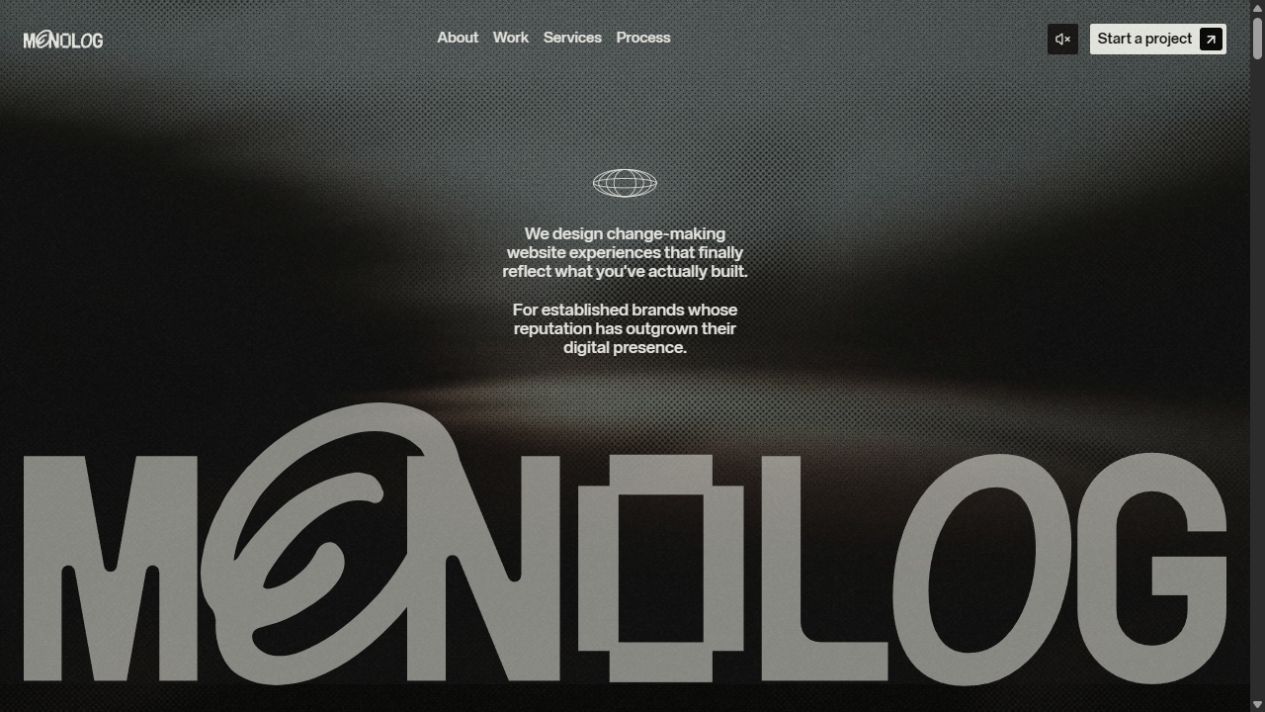
MONOLOG desktop homepage with warm monochrome styling and restrained hero positioning.
Captured September 15–16, 2026. Image dimensions describe the saved files. Mobile research used a 390 × 844 CSS-pixel viewport; saved images may be resized. Each frame records one moment, not the complete animation.
The hero stays tall, with small centered positioning copy and the wordmark near the bottom. That quiet copy still has to earn its place through comfortable reading size and contrast.
The September 2026 mobile menu also exposed duplicate editorial headlines with placeholder links. Those small unfinished surfaces matter because they appear precisely when an interested visitor starts exploring beyond the main page.
Treat menus and secondary panels as part of the same authored experience.
Chapter 05 / Takeaways
Finish the places curiosity leads.
MONOLOG's strongest lesson is its persuasive sequence: a point of view, visible work, an explanation of the engagement and answers to practical doubts. That sense of care needs to extend to every published destination, including the ones outside the main narrative.
Pair a personal point of view with work and practical answers.
All seven published case URLs returned generic shells during the source review; one was also confirmed live without a case study. The main work cards linked to external client sites, so those are separate findings.
Keep the warmth, About panel and practical FAQ. Complete the case destinations and menu content, clarify filtered counts, and explain the external AI-evaluation links in words a visitor can understand.
The depth of the experience should match the care of its introduction.
The reading room
Stay curious.
Go deeper.
Build trust through the story, then honor it at every destination.
Based on research captured September 15–16, 2026. Interactive illustrations explain design principles; the linked reports contain the observations, screenshots, and source evidence.