Study 06 / Noho
Room for a Little Play
A furniture concept pairs playful images and generous type with a visible choice for a calmer experience.
Enter the story Five chapters. A different way of looking.Let’s follow it.
Chapter 01 / Idea
Give the object a personality.
A chair can be shown as an object, or as something that changes the mood of a room. Noho chooses the second approach. People lift it, frame themselves with it, and sit in unexpected ways. A steady block of type gives that playful photography a clear introduction.
The desktop hero divides the screen between a large statement and a staggered image grid. Warm neutral surfaces make the colorful photographs feel deliberate without competing with the furniture.
This is a study of noho.ink, a design concept credited to Eugene More. Its tested Buy action opened a disclosure about the concept and the original brand imagery. The interface should be read in that context, rather than as evidence of an operating store.
Show the character of the product, and make the status of the experience clear.
Chapter 02 / Type
Large type can travel light.
The mobile headline stays almost the same size as the desktop headline. Noho changes the line breaks and moves the photographs beneath the introduction. The voice stays confident because the composition does the adapting.
- Font size
- 60.048px
- Line height
- 60.048px
- Recorded source family / weight
- Switzer 600
Keeps the headline large while changing its line breaks and composition.
Desktop 60.048px → mobile 60.6684px.
Measured at 1440 × 1000 desktop and 390 × 844 mobile, September 20, 2026. This scaled diagram uses the library’s PP Neue Montréal, not the source typeface. Its SVG units show twice the recorded size; on-screen pixels vary with the frame.
The measured hero uses Switzer 600 at 60.048px on desktop and 60.6684px on mobile. Tighter mobile leading holds the short lines together. Regular-weight supporting text gives the reader a quieter second voice.
Utility text follows a different rule: the energy explanation grows from 10.512px to 16.2513px. These are exact computed samples at the two recorded widths, not fixed design tokens. The visible hero uses paragraph elements, so its visual hierarchy is stronger than its semantic heading structure.
Adapt each text role for its job; a smaller screen does not require every role to shrink.
Chapter 03 / Motion
Make room for a calmer choice.
An energy panel puts two preferences beside the navigation: dark mode and reduced animation. It brings the site's environmental theme into a control the visitor can use. The useful idea is the choice itself, with clear limits on what its rating can prove.
Light surface · Tilted chair. Both choices remain independent.
Original illustration. These controls change this diagram only. They do not estimate energy usage or reproduce Noho’s animation engine.
Dark mode changes the palette; selecting both preferences changes the displayed rating to Low.
Pointer controls and preference persistence were exercised. Battery savings and complete animation suppression were not measured.
Recorded September 20, 2026.Pointer testing changed the palette and switch states. Selecting both options made the displayed rating read Low, and the reduction preference survived navigation. Public code stores that preference and calls registered animation handlers.
No battery or rendering benchmark was performed. The site's battery-saving claim remains unverified, and the manual switches lacked native keyboard semantics in the inspected DOM. This original illustration uses named buttons and shows two independent visual choices without inventing an energy measurement.
Give visitors a useful preference, then describe its effect at the level the evidence supports.
Chapter 04 / Mobile
A new arrangement, the same invitation.
The split desktop hero becomes a sequence: navigation, headline, supporting line, then photographs. Energy usage moves into the narrow top strip. The image grid retains its uneven rhythm while the introduction becomes easier to read in one direction.
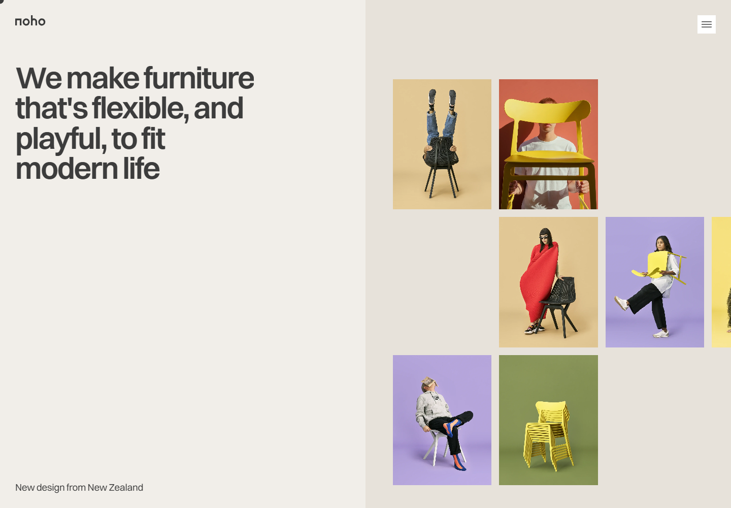
Noho at 1440 × 1000: large type and a staggered furniture image grid share a split hero.
Captured September 20, 2026. Image dimensions describe the saved files. Mobile research used a 390 × 844 CSS-pixel viewport; saved images may be resized. Each frame records one moment, not the complete animation.
At 390 × 844, the open menu uses product imagery and wide rows for section and social links. That is a distinct composition from the desktop's compact horizontal navigation strip.
The captures document Chromium viewports and pointer actions. They do not establish physical touch behavior, short-screen usability, or consistent keyboard exits across overlays. Those remain useful next checks before adapting the pattern for a production interface.
Preserve the voice by changing the order and arrangement around it.
Chapter 05 / Takeaways
Play needs a clear explanation.
Noho's strongest connection is between the furniture's character and the interface's behavior. The pictures invite play; the energy panel offers a calmer mode. Both can belong to the same identity when the practical meaning stays clear.
Turn a brand value into an understandable choice within the interface.
Keep the product-led photography, large mobile type, and visible preferences. Improve the semantic headings and switch controls, and explain that the rating reflects selected preferences unless actual consumption is measured.
The September 20 review also found commercial copy that needs context: a store-closure article appears alongside shipping statements. Make the concept status clear early, then verify complete product, quiz, and overlay journeys before drawing conclusions about usability or conversion.
Let expressive design invite exploration, and let precise language protect trust.
The reading room
Stay curious.
Go deeper.
Give the product room to play. Give the visitor clear choices and dependable controls.
Based on research captured September 20, 2026. Interactive illustrations explain design principles; the linked reports contain the observations, screenshots, and source evidence.