Study 05 / Lama Lama
A Brand With Room to Play
Pixels, compact controls and personal surprises turn an agency identity into a shared way of behaving.
Enter the story Five chapters. A different way of looking.Let’s follow it.
Chapter 01 / Idea
One identity, many little invitations.
Lama Lama's pixel logo is only the beginning. The same character appears in image treatments, mono text reveals, contextual messages and compact controls. The result feels like an agency with a way of doing things, extending its personality from the hero into the smallest interaction.
A centered menu floats as a small object over cinematic media. Below, compact work rows give way to broad images and offset culture photographs, changing the pace without losing the shared visual language.
The work index makes that personality useful. Names, categories and image strips support quick scanning, with more narrative and media available once a project catches the visitor's interest.
Choose a small set of brand behaviors that can travel across the interface.
Chapter 02 / Type
A declaration and its small print.
The headline arrives as a dense uppercase shape. The explanation uses more open sentence spacing. Around them, small mono labels name categories and actions. This contrast gives Lama Lama its mix of confidence and precision, with careful distinctions needed where metadata becomes a control.
- Font size
- 72px
- Line height
- 57.6px
- Recorded source family / weight
- Suisse BP Intl 700
.8 leading creates a dense, emphatic uppercase shape.
Desktop 72px → mobile 40px.
Measured at 1440 × 1000 desktop and 390 × 844 mobile, September 15–16, 2026. This scaled diagram uses the library’s PP Neue Montréal, not the source typeface. Its SVG units show twice the recorded size; on-screen pixels vary with the frame.
The hero measured 72px with 57.6px leading on desktop and 40px with 32px leading on mobile. Body copy has more breathing room, and both its width and position change for the narrow layout.
Mono action labels remain 10px on both measured viewports. Brackets, outlines and arrows help separate roles, but important mobile actions may need a more comfortable size to make that distinction clear.
Let expressive headlines and practical reading text use different rules.
Chapter 03 / Motion
The interface has a playful streak.
A work row opens into a preview. A team name brings up a portrait and a personal caption. A compact hub can become a presentation or an inquiry flow. These discoveries share a visual character, making the surprises feel like parts of the same place.
Small repeated units make one image.
Original abstract illustration of the grid idea. These generated shapes do not use a camera or reproduce the source shader.
The implementation requests a front-facing camera stream and renders it through the branded grid.
Camera access was deliberately not activated. Source shows that reverting stops all stream tracks and clears the video source.
Recorded September 15–16, 2026.The desktop Neurons Lab preview and draggable gallery were exercised, along with team portrait changes. The pitch deck was a functioning ten-slide presentation, and its explicit close control worked.
The contact camera treatment was confirmed in public code but never activated. The review also found that Escape did not close the desktop deck in its tested state: more modes bring more conventions to keep consistent.
Make discovery rewarding, and make leaving each discovered layer obvious.
Chapter 04 / Mobile
Same character. A different gesture.
Lama Lama gives touch its own interactions. Service columns become a horizontal strip, and the tested mobile work row opens a dedicated case. Awards use a persistent disclosure that stays open for reading, preserving the discovery without asking the visitor to keep holding.
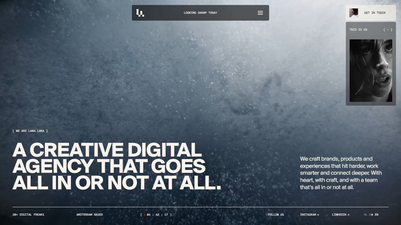
Lama Lama desktop homepage showing its agency typography and media-led composition.
Captured September 15–16, 2026. Image dimensions describe the saved files. Mobile research used a 390 × 844 CSS-pixel viewport; saved images may be resized. Each frame records one moment, not the complete animation.
The review verified the mobile service drag and awards expansion. Desktop awards use a temporary press-and-hold reveal in the inspected implementation; that sustained desktop gesture was not fully exercised live.
The deck also has mobile-specific swipe and tap-zone behavior in source, with incomplete physical-device testing. The broader lesson is to choose a suitable gesture per surface and verify its entry, exit and reading state.
Translate the intent of an interaction into a gesture that suits the device.
Chapter 05 / Takeaways
Give the play a dependable frame.
The strongest thing to borrow is the relationship between Lama Lama's effects. The pixels, labels, previews and presentation mode reinforce one character. Keep that coherence, then make the practical frame equally dependable: clear controls, readable labels and predictable ways back to the page.
Repeat a few distinctive behaviors until they become a recognizable language.
The persistent work filter is a useful example: selecting E-commerce updated the URL, count and matching rows. Personality and a shareable, understandable state can live in the same component.
The September 2026 review prioritizes consistent modal exits, clearer field errors and incomplete content, including the sparse AI page and placeholder Cubby narrative. Its source coverage does not certify every interaction or device.
A playful system earns its freedom through dependable controls.
The reading room
Stay curious.
Go deeper.
Keep the surprises. Give them a consistent way in and out.
Based on research captured September 15–16, 2026. Interactive illustrations explain design principles; the linked reports contain the observations, screenshots, and source evidence.