Neue Montréal
A living type specimen: editorial hierarchy, interactive typography, responsive behavior, and public-source evidence for Neue Montréal.
Explore the story Five interactive chapters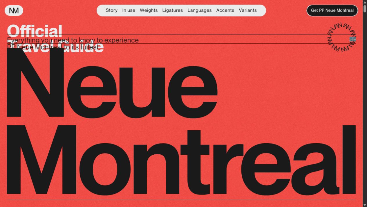
Neue Montréal desktop cover presenting the typeface as an editorial specimen.
Full size (new tab)Reviewed September 15–16, 2026 · Live website · Research findings
This page brings together the website review, typography follow-up, and public-source findings for Neue Montréal. Observed behavior, source-confirmed implementation, hook-only findings, and interpretation remain distinct. Viewports and shared coverage limits are recorded in Reading this research.
Website review
Creative assessment. This is the clearest example of interaction serving the actual product. Variable weights, optical styles, ligatures and alternates become experiences visitors can see, compare and manipulate. The Montréal travel-guide concept supplies enough imagery and editorial material to hold a very long page together. It is the richest reference here for art-directed product education. Live site
Typography, palette and layout
- Type: PP Neue Montreal and PP Neue Montreal Text, including variable and italic faces. Display weights span Hairline through Black; the Text family provides a smaller weight range. The product supplies the interface's identity.
- Color/material: dark
#1a1a1a, paper#f0e7d4, red cover, and saturated pink, green, yellow, blue, orange and violet chapters. Grain, postcards, tickets and folded paper tie the digital work to printed ephemera. - Grid: editorial columns and fine rules give way to edge-to-edge word specimens. Contrast comes from density and scale rather than adding cards around everything.
- Navigation: fixed rounded identity/purchase pills flank a central desktop section-navigation pill. This softer chrome separates controls from the large printed composition.
The inspected desktop cover showed overlapping introductory text/rules at 1280×720 on repeat visits. The mobile cover resolved into a clearer stack. Treat the desktop overlap as a captured layout/rendering issue at that size; the underlying cause was not diagnosed.
Neue Montréal desktop cover
The complete editorial journey
The page begins with a red travel-guide cover and enormous type, then a dark manifesto using alternating colorful words. Postcards lead into the history/story section, text/display weight lists and a timeline. Orbiting sample images introduce another change of pace. Video-backed, scroll-driven weights then turn typography into a live demonstration.
Eleven colored city-attraction panels associate places with weights and hide editorial copy inside an accordion. A cream Text-versus-Display comparison uses oversized lowercase forms, followed by a larger split-character section that exposes differences in construction. Three colored ligature circles are followed by a selectable weight chart.
The later chapters cover languages using flags/exhibition imagery, diacritics through diagonal strips, printed tickets, animated punctuation, and a folded brochure that opens with scrolling. A variants strip introduces related products before the red footer and oversized name return the visitor to the cover's visual language. The measured page was roughly 19,800 CSS pixels tall at one desktop size, illustrating the length rather than a fixed universal dimension.
Interaction and motion inventory
| Trigger | Response | Evidence | Why it matters |
|---|---|---|---|
| Scroll weight chapter | Display moves Black → Hairline while Text grows heavier | Observed + source | Makes the variable design space understandable |
| Click a colored city panel | Selected story opens; other panels compress | Observed | Combines specimen and editorial discovery |
| Choose Hairline/other weight | Main chart specimen updates visibly | Observed | Gives direct control over the product |
| Switch Display → Text | Available weights and specimen change | Observed | Communicates optical-family differences |
| Pointer over postcards | Tilt/gravitation with return on leave | Tilt observed in follow-up; return behavior source-confirmed | Reinforces physical printed-object metaphor |
| Orbiting images enter view | Fan outward and rotate around center | Observed motion + source | Keeps a dense specimen collection visually light |
| Scroll split glyph | Optical/weight comparison changes spatially | Observed + source | Turns tiny typographic differences into large evidence |
| Ambient punctuation/variant cycle | Forms alternate and morph | Observed + source | Shows alternate construction rather than random movement |
The configured variable-weight mapping runs display 900→100 against Text 200→700 and completes by .7 of its configured scroll progress. The orbit rotates once per 40 seconds and pauses offscreen; its inspected component has no drag handlers, so it should not be described as a draggable carousel. Desktop postcard tilt permits 20° and scale 1.1; mobile variants reduce tilt to 1° and scale 1. Punctuation uses a .8s morph and 1s pause. Variant switching runs every 1800ms; the wave headline uses a 1.4s duration and .07s character stagger. Source details
Mobile changes and issues
The strongest responsive change in this set is the city accordion: desktop's narrow vertical color panels become stacked horizontal rows with names, numbers and chevrons. I opened the Biosphere row and inspected the expanded story. It preserves the color/weight concept while changing the interaction geometry for a narrow screen.
The hero stacks; ligature circles become vertical; postcard tilt is reduced. Some comparisons remain side by side to preserve their meaning. The weight tester continues to work, including switching from Display to Text and reducing the available weights appropriately.
The central section navigation disappears at mobile width, while the logo and purchase control remain. I did not find a replacement top-level section menu in that header. On a roughly 17,000px mobile page, that trades orientation for cleaner presentation. A compact chapter menu would be useful without undermining the design.
The inspected weight controls use custom elements rather than native buttons/inputs. That does not by itself prove total inaccessibility, but keyboard operation, focus indication and programmatic selected state need an explicit audit. Several specimens are SVG paths rather than ordinary text, making meaningful surrounding labels especially important.
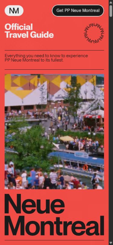 Neue Montréal mobile
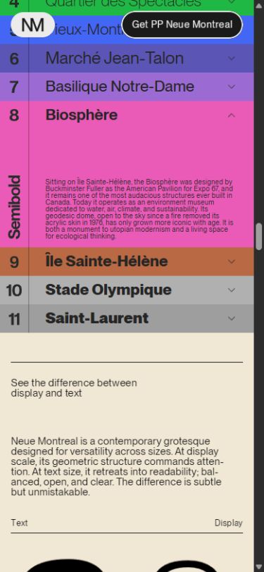 Neue Montréal mobile accordion
What I would keep: the travel-guide concept, purposeful motion, extreme type scale and component-specific responsive decisions. What I would improve first: mobile chapter navigation, semantic/focus behavior of custom controls and the captured desktop-cover overlap. Preserve the spectacle but let a returning visitor reach a particular specimen quickly.
Typography and pointer behavior
Type was sampled at 1440×1000 desktop and 390×844 mobile viewports. The table gives computed size / line height in CSS pixels. These are observed roles, not an exhaustive token specification or proof of a separate font file for each computed weight. Measurement method and limitations · Raw computed-style samples.
| Site and role | Typeface / weight | Desktop | Mobile | What the difference does |
|---|---|---|---|---|
| Neue cover title | PP Neue Montreal Bold 700 | 74.08 / 66.67 | 29.6 / 26.64 | Compact .9 leading makes the title a single graphic block |
| Neue cover explanation / Story label | PP Neue Montreal Text Regular 400 | 24 / 24 | 15 / 15 | Editorial density comes from 1.0 leading and −.03em tracking |
Attention and reading order
The cover establishes a publication metaphor: title, explanatory line, rules, a large product name and imagery. The name functions as a specimen, not merely a label. Subsequent chapters alternate an emotional typographic statement with a more structured explanation of the family.
In the Story section, the left column explains the typeface while the middle and right columns list Text and Display weights. The sizes are deliberately similar. Position, alignment and rules—not a bigger title on every column—carry the hierarchy. This is why the dense page still feels organized.
The sequence also answers progressively more specific questions: what is it, where does it come from, how does it look in use, what weights exist, how do optical styles differ, which glyphs/languages are supported, and where can it be obtained. That is a stronger information architecture than a series of unrelated visual demos.
Type and reading density
The cover title measured 74.08px/66.67px at 1440px wide and 29.6px/26.64px at 390px. Explanatory/Story styles measured 24px/24px and 15px/15px, with −.03em tracking. This creates a compact printed texture. It is visually convincing, but the 1.0 leading is tighter than I would choose for sustained prose on a general information site.
The huge word specimens and logos may be SVG artwork or transformed components. Treating their surrounding element's font size as the visible glyph size would be misleading. The visual contrast comes from the final letterform bounds, not just CSS tokens.
At 1440×1000, the cover resolved cleanly into separate title and explanatory bands. The overlap documented at 1280×720 remains a narrower/shorter-viewport observation, not a universal description of the cover.
Newly tested pointer details
- Moving over the postcard image produced a live 3D transform and enlarged/tilted the card toward the pointer. Its perspective makes it feel like a printed object held in space. This upgrades the earlier source-confirmed tilt to observed behavior.
- The purchase control animates individual letters vertically on hover. A hovered letter was measured partway through its upward translation. It preserves the label while introducing motion, rather than replacing the CTA with unrelated text.
- The postcard's pointer cursor suggests additional interaction, but this pass did not establish a separate click outcome. Do not infer a flip or navigation purely from that cursor.
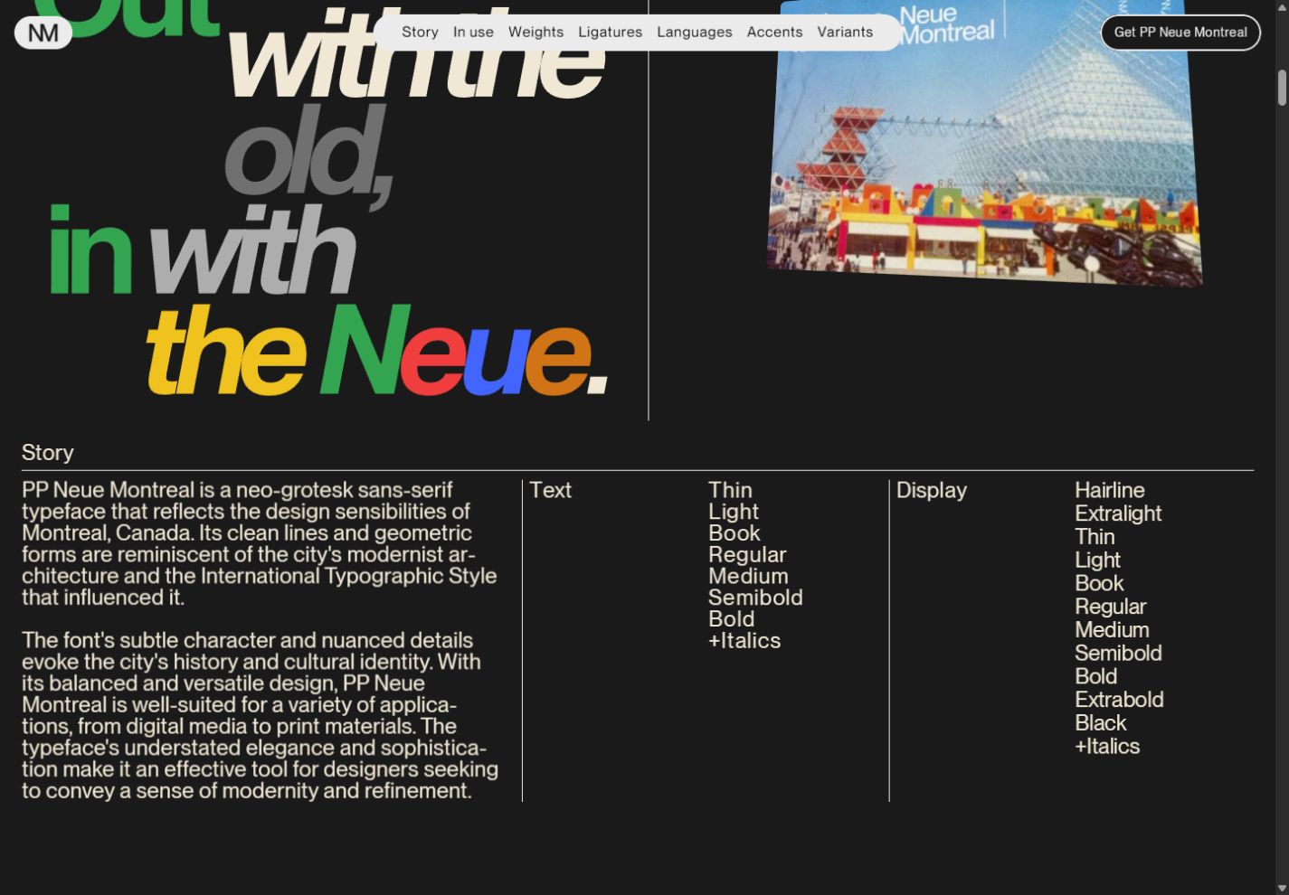 Neue Montréal: structured Story columns and a tilted postcard
Direction I would give the team: preserve the editorial density and typographic comparisons. Add a compact mobile chapter index, and ensure every specimen control has meaningful keyboard behavior and selected-state labeling. The page should support both leisurely exploration and direct reference.
Public-source audit
These findings come from public HTML, CSS, JavaScript, and sitemaps. A shipped definition does not prove an active feature: configured means an invocation or page markup is present; implemented means its handler was inspected; hook only means the custom handler was unavailable. Source scope and limitations.
- Neue HTML: https://neuemontreal.com/; application https://framerusercontent.com/sites/45hQNNcMArzuoHlzx9jZaS/7OrBmzrr11EPkzHu6vKirIbGo0YLgybo7shxc4A6qus.mA0RSvhl.mjs.
Typeface system and palette
The product is the typeface. Actual rendered styles use PP Neue Montreal, PP Neue Montreal Text, and variable fonts of each. The face declarations cover Hairline 100, Extralight 150, Thin 250, Light 300, Book 350, Regular 400, Medium 500, Semibold 600, Bold 700, Extrabold 800 and Black 900, with matching italic variants. Text optical family includes Thin through Bold. Inter declarations are incidental framework/shared styles, not evidence that the specimen identity is based on Inter.
Core neutral tokens: dark #1a1a1a, paper #f0e7d4, gray #ebebeb/#b5b5b5. Exhibition accents include red #d82f2f, pink #dc3c84, green #18bc42, yellow #efc21e, blue #4365ff, acid yellow-green #bdd116, orange-red #ff4000, violet #6157bd, lilac #a26ed6, pink #f66bc8, brown #b76745, and fluorescent green #00ff40. The actual city accordion has closely related per-panel colors; do not assume its RGB values exactly equal all global tokens.
Page breakpoints include 810, 1440 and 2000px, while component breakpoints also use 1200 and the accordion uses 1024. Multiple responsive regimes are deliberate component behavior, not one uniform CSS breakpoint.
Verified custom motion and interaction
- Variable-weight scroll specimen.
withScrollWeightContainermaps scroll progress to main/display weight 900→100 and reverse/text weight 200→700. It writes actualfont-variation-settings: "wght" ...and changes labels through Black→Hairline and Text Thin→Text Bold. The change completes at .7 of the configured scroll progress. This demonstrates the typeface's design space, not generic decoration. - City accordion.
HorizontalAccordionis actually populated with eleven Montréal stories. Click selects/opens a panel. On narrow views it becomes stacked vertical panels; configured mobile breakpoint 1024, closed height 56, label left inset 20 and number rotation -90. Desktop openSize is 4.8 relative to closed panels. This hides substantial editorial content inside a colorful visual specimen. - Hovering postcard/images.
Hover3Dinstances are explicitly configuredeffect:gravitate, perspective 500, scale 1.1 and tilt limit 20 for desktop-size cards. Mobile card variants use scale 1 and tilt limit 1. Pointer leave returns transform to zero with a .2s ease-out transition. - Circular image carousel. Actual invocation uses 40 seconds per full spin, 1200ms intro, orbit radius .32 of the container's shortest side. Images are pre-rendered to canvases, fan outward and rotate around the center. IntersectionObserver threshold .2 pauses requestAnimationFrame when offscreen. There are no drag/click handlers in this custom component; do not label it a draggable carousel without separate browser evidence.
- Morphing semicolon. Actual
MorphSemicolonswaps square and round dot/comma outlines, fluorescent green fill, .8s morph, 1s pause, 1.8s initial delay. It dispatchesmorphTickas the alternation changes. This is a literal demonstration of alternate punctuation construction. - Text variant cycling.
withVariantSwitchtoggles paired variants every 1800ms, with a delayed start. It preserves separate desktop/mobile variant IDs. - Split character comparison. An actual
ScrollSplitCharacterinstance labels its halves “Display Extrabold” and “Text Medium”, uses the cream background and dark text, and responds to scroll/viewport measurements. This is an optical-size/weight comparison mechanism, not a standard text box. - Wave headline. Actual
WaveTextsets “Already in Use, Worldwide!” in PP Neue Montreal Extrabold Italic 800, orange#ff4000, tracking -.04em, line height .9, wave height 12, 1.4s duration and .07s character stagger. Characters translate up/down individually in a continuous wave. - Smooth scroll and entrance. Actual SmoothScroll intensity is 10 (Lenis-backed component). PPNMPreloader contains Lottie animation data authored from Cavalry; separate VimeoFill is configured autoplay. Lottie is therefore used, although not every bundled Lottie capability is meaningful to the page.
Navigation / coverage
Sitemap contains only the homepage. Anchors found: /#enveloppe, /#caroussel-circulaire, /#graisses-scroll, /#letter-weights, /#ligatures-circles, /#languages, /#accents-bandeaux, /#alternatives-versions. Product links go to Pangram Pangram Neue Montreal, Neue Montreal Mono and Off Type Neue Montreal. Purchasing/license transactions were not tested. Many specimen glyphs/logos are SVG paths; visible letters are not always editable HTML text.
Read across the collection
Research findings · Compare typography · Research methodology